

The horizontal bar charts are the graphical representation of the specific measurement results (packet loss, latency, successful and failed probes) obtained by IRP while performing numerous probes via all the providers.
Note:
- The provider with the best packet loss data is always placed on top of the others
- Filtering by date range and providers allows reviewing of past data or average performance over longer time intervals as well as showing/hiding specific providers.
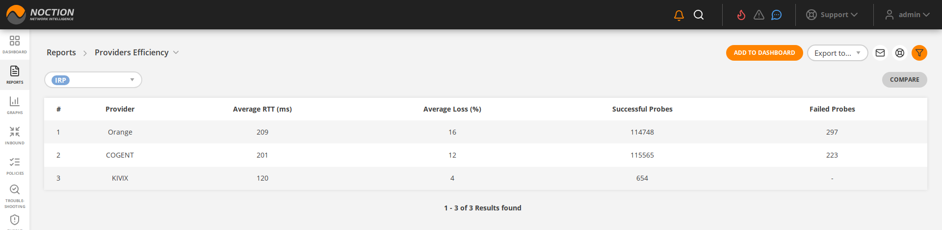
Figure 3.5.29: Providers Efficiency
While some providers seem better performing (for example, MDIX in the provided screen capture), the fact that they display a much smaller number of probes clearly indicates they are Internet Exchanges with only a few peers interchanging data with a given network.
A table view with exact details of the data is available in the report form as well.
See also: Providers Efficiency