- Probe Conversion report
- Loss Improvements report
- Latency Improvements report
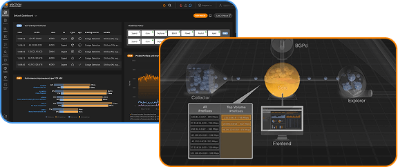
Monitoring probing efficiency with Probe Conversion report
Probes are actual measurements of performance taken by IRP while measuring different available paths. IRP probes only those destinations with high enough bandwidth usage that will make a difference. IRP does not make improvements for routes that measurements show to be optimal. When IRP identifies an alternative route that is better than the current route, the platform generates an Improvement. In a perfect network configuration IRP should not be able to generate any Improvements. The aggregated Probe Conversion report highlights the overall number of probes and the number of probes that have resulted into improvements. Additionally, this report highlights the type of improvements be they performance (loss or latency), cost, or commit control.
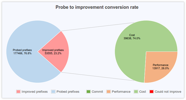
The image above is taken from a live environment. The report shows that the conversion ratio of probes into improvement is quite big and significantly exceeds the ‘perfect network’ target of zero improvements mentioned above. Still, the main reason for this large number is bandwidth cost. It is fair to conclude that some of the providers are more costly resulting in three quarters of the improvements being cost based (moving traffic away from expensive providers). Cost improvements might not make your network better but will definitely reduce bandwidth expenses.
Tracking packet loss reduction with Loss Improvements report
Packet loss occurs in all networks. There are many things that might cause a few packets to be lost on their way to a destination and back. Still, if IRP detects packet loss towards some destinations it will probe the alternative available routes. When it identifies a path that is clearly better, it will announce an improvement. The Loss Improvements report highlights the collected statistics regarding Loss Improvements. The main characteristics of the report are the four ‘populations’ that the graph shows data for:
- All destinations: covering everybody on the Internet (that had some traffic addressed to them)
- Problem destinations: that include only those destinations that IRP detected packet loss on
- Loss eliminated group covers those destinations that initially had some packet loss on them and subsequently IRP was able to identify a route without packet loss to reach them
- Loss reduced group covers those destinations that IRP was not able to find a route that eliminates all packet loss. Instead IRP was able to find a route with lower packet loss rates for these destination

The chart above shows the statistics for the four mentioned groups. The yellow bars represent the improvements. The gray bars show the residual values that IRP was not able to improve. The graph shows that the packet loss rate on the network used to be ~4.5% and IRP was able to eliminate ~2.9%. If we exclude destinations without problems we can see that for “Problem destinations” packet loss rate was above 55% and IRP was able to eliminate almost 35% of it. One of the shortcomings of the above representation is that the numbers for “All destinations” will be always very small compared with the other groups due to the fact that under normal circumstances most destinations will not suffer packet loss. To address this the report includes a “Loss relative rates” chart where all the numbers are scaled to 100%. This chart highlights how much of the original packet loss rate has been eliminated by IRP. In this representation we can see that the initial ~2.9% out of ~4.5% represents a comparable 62% reduction in packet loss similar to the ~35% out of ~55%. This way you can see that IRP was able to reduce packet loss by 62.41%

While the above charts present the rate of improvements it is not quite clear how large are each of the mentioned ‘populations’. The final chart of the report presents data about the size of each group
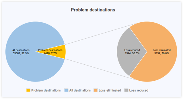
IRP highlights in this chart that during the specified time period only on 7.7% of destinations IRP has detected packet loss. IRP was able to reroute 70% of them over paths without loss meaning that packet loss was caused by some intermediary on the default route and the new route no longer suffered from them. On 30% of destinations IRP was not able to eliminate loss and these problems might have been an overloaded destination network or a shortage on all the providers our customer works with.
Monitoring latency reduction with Latency Improvements report
Latency is the other important indicator of network performance. It represents the time taken by a packet to reach a destination. Again, IRP distinguishes four ‘populations’:
- All destinations
- Problem destinations represent the destinations where IRP was able to identify an improved alternative route.
- 20% or more represents the destinations where IRP was able to find an alternative route that reduced RTT by more than 20% of initial value.
- 50% or more represents the destinations where IRP was able to find an alternative route that reduced RTT by more than 50% of initial value. Latency is measured in milliseconds and the chart that follows shows these data.

Again, in order to be able to set a percentage value to the numbers above IRP scales the numbers above and presents the chart that follows.

And finally, to highlight ‘population’ sizes the report includes the third chart.
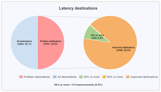
The chart above shows that almost 50% of destinations are considered problematic. This might be excessive and raise some concerns. For example, in the case of a high number of problematic destinations it is recommended to review the thresholds for latency improvements. The margin when an alternative route is considered better are given by the Core configuration parameters Relevant RTT difference in milliseconds and percentage. The default values for these are 10ms and 10% and you might consider to adjust them to better fit the specifics of your network.