


Disclaimer*:
The data presented in this report card is intended for information purposes only and is not to be interpreted as any form of promotion or debasement for carriers herein named. Information is obtained from the IRP Lite instances, where the compulsory consent of the legal entities for collection of such information is part of the Terms and Conditions document.
< The report covers broadly used Tier 1 carriers performance results in the US and the general spread for the month of October 2017. For the US results, rare datapoints from distant locations e.g. Alaska have been omitted.
The presented analysis is based on more than 860 million successful probes that span the entire month. All data is aggregated per carrier on a daily basis and accounts for many thousands of successful probes. A control group (labeled C) is used as a base of comparison. The control group aggregates the average for all transit providers in a network, including Tier 1 carriers.
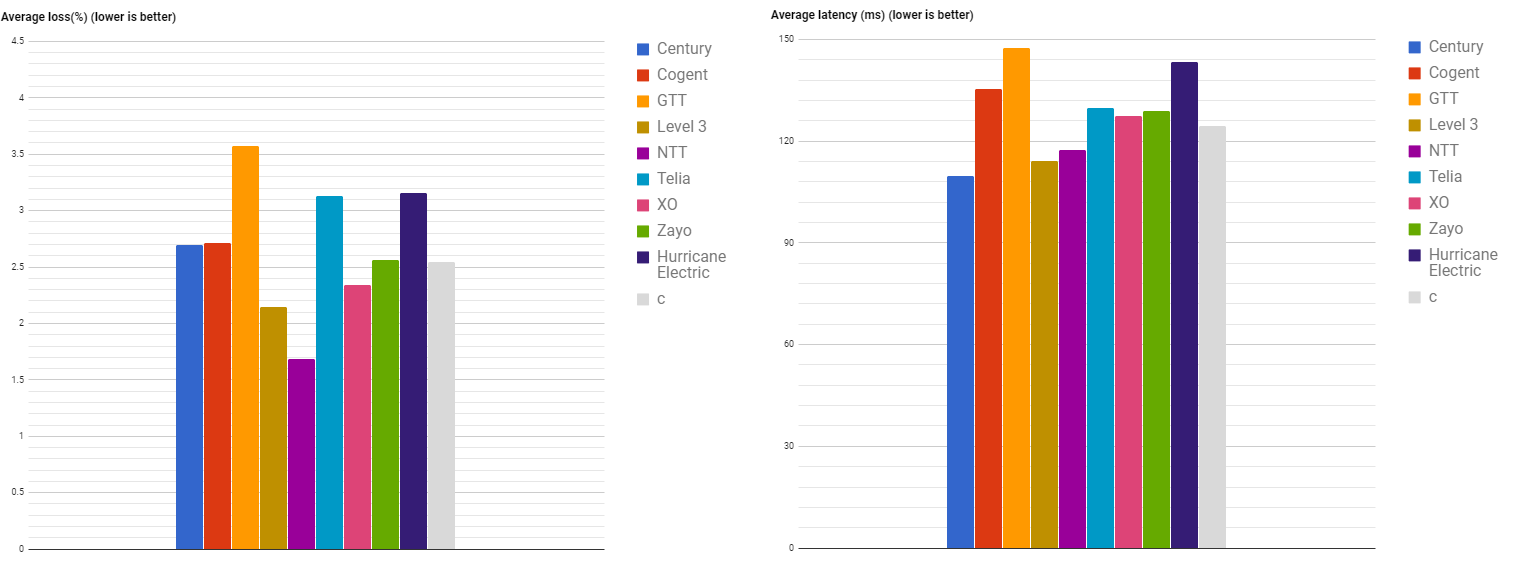
Fig. 1. Average Loss and Latency in October 2017
The charts include a control group C (gray) to allow cross comparison.
The values for September 2017 are included for cross comparison.
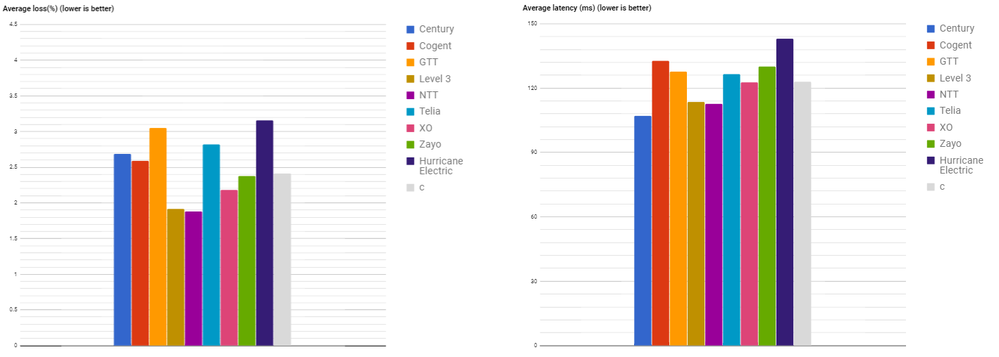
Fig. 2. Average Loss and Latency in September 2017
The charts include a control group C (gray) to allow cross comparison.
Average packet loss analysis:
- NTT and Level 3 occupied the leading positions in October 2017, closely followed by XO. Zayo, Cogent and Centurylink results for October are close to the control group level;
- A higher level of average loss has been registered for GTT, followed by Hurricane Electric and Telia;
- There aren’t any large discrepancies in the distribution of average packet loss for the Tier 1 carriers when comparing October and September data. NTT improved its results, diminishing the average packet loss and strengthening its leader position. Inferior average packet loss has been registered by GTT, Telia, Level 3 and Zayo. Centurylink, Cogent and Hurricane Electric maintained approximately the same average packet loss as in September.
Average latency analysis:
- In October, Centurylink, NTT and Level 3 have registered lower average latency than the control group level value, with the best results shown by Centurylink. Telia, Xo and Zayo have presented roughly the same results as the control group level value. The higher level of average latency registered GTT, followed by Hurricane Electric and Cogent;
- A significant change in average latency for the month of October, compared to September, has not been observed. Average latency value of the control group level has not changed. GTT showed worse results than in the previous month. Other Tier 1s presented about the same results as in the previous month;
The charts below illustrate the performance of each carrier in comparison to the control group.
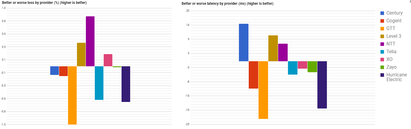
Fig. 3. Better or worse Loss and Latency in October 2017
The numbers are differences from average control group.
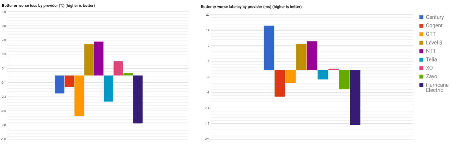
Fig. 4. Better or worse Loss and Latency in September 2017
The numbers are differences from average control group.
In comparison with the control group for the month of October, 2017 :
- NTT, Level 3 and XO showed better results in terms of Loss. The leader of this group, NTT, registered a lower packet loss average than the control group level (2,55%) by ~ 0.9%, followed by Level 3 (~ 0.4%) and XO (~ 0.2%). GTT showed substantially worse results in terms of Loss, exceeding the packet loss average by more than 1%. Centurylink and Telia results were not far from GTT, surpassing the packet loss average by ~ 0.6%;
- Centurylink, Level 3 and NTT presented better results in terms of Latency. Centurylink latency was lower than the average latency of the control group (124,5 ms) by ~ 14 ms, Level 3 by ~ 10 ms and NTT by ~ 7 ms respectively. GTT has registered worse result in terms of Latency. Its average packet latency exceed the control group’s one by ~ 22 ms. Hurricane Electric was highlighted with a latency surplus of ~ 19 ms compared to the control group average.
In comparison with the data from September, 2017 :
- NTT, Level 3 and XO kept their leader positions as in September. GTT and Telia increased the packet loss average in comparison with the previous month. Hurricane Electric and Centurylink improved their results in comparison with the ones from September; however, still remained in the group of Tier 1’s with higher packet Loss than the control group average
- Centurylink kept the leading position in terms of Latency, while XO migrated into the losers’ category. GTT has shown a significantly worse results than for the month of September in its average Latency level.
Loss
For the Loss analysis we use a scatter plot, where average values by control group are assumed on the diagonal while the horizontal and the vertical axis highlight carrier metrics. All data-points below the diagonal represent the better performing carriers and vice versa.
Abnormally large losses are still registered for a large number of datapoints. We consider excessive an average above 4.5% packet loss. Given the fact that Tier 1 carriers are characterized by both low loss values for some networks and abnormally high losses for other networks, the conclusion is that high loss values are not caused by the carriers themselves but rather are caused by the networks they service or the networks they peer with. Whether the true cause is poor design, over-provisioned links or deficiencies in peering governance – this report cannot tell. What we can mention is that for many networks, whether permanently or sporadically, there is definitely an opportunity to improve things.
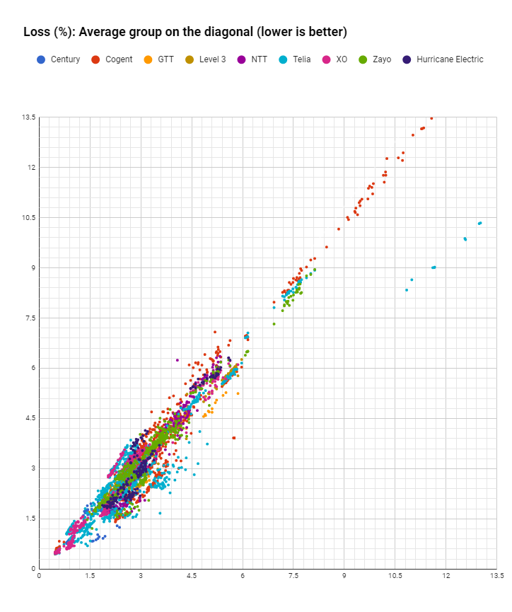
Fig. 5. Loss values spread on average diagonal
Datapoints comparison with diagonal.
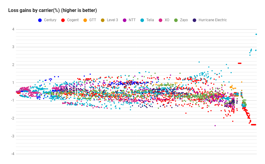
Fig. 6. Better or worse carrier loss (%)
Average placed on the zero line
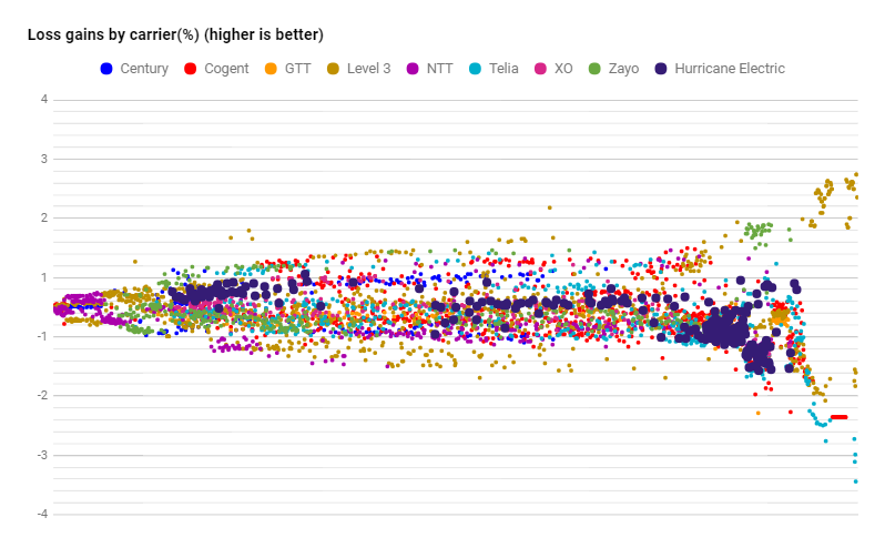
A different representation of the above data places it around the control group (zero line) with gain values by carrier. Values are sorted and charted from left to right by increasing average loss. The chart depicts gains or worsening on a network based on the average control group’s performance – values are shown from left to right following better to worse loss values. The assumption of this analysis is that while a network’s conditions might be better or worse compared to other networks, the conditions tend to be equal across all carriers including the control group. While the carrier’s network is not the culprit causing additional loss, this analysis might be able to suggest whether those carriers peering with remote regions are deficient. Non-systemic issues with carriers will tend to cancel out with values being scattered equally above or below the zero line while systemic issues or gains will have a tendency to place a carrier consistently above or below it. The scatter plot highlights this assumption. More so, if we average gains or losses compared with the control group we expect the noise to cancel out.
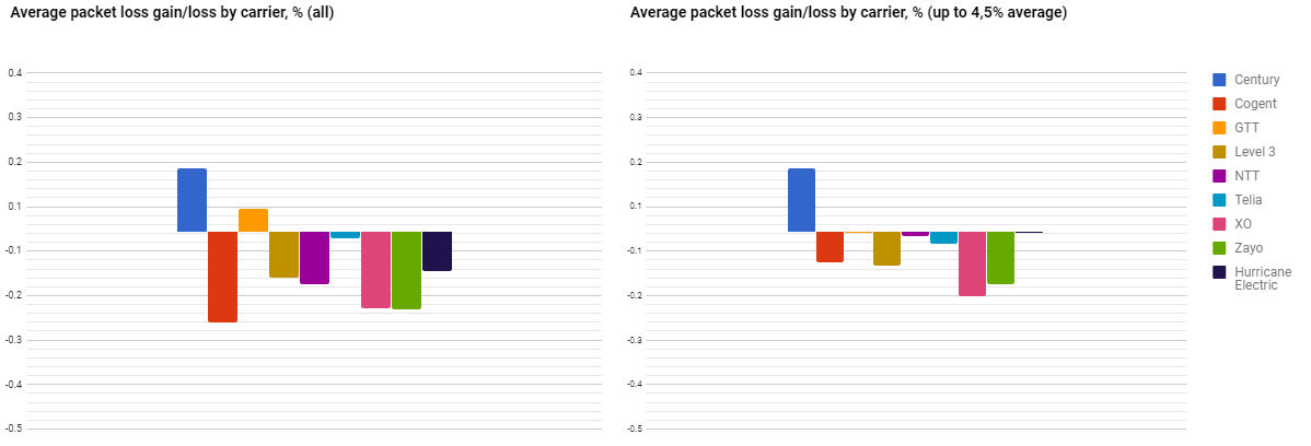
Fig. 7. Average packet loss gains/losses by carrier October 2017
Averages determined for ALL datapoints or a cutoff at 4.5% control group applied.
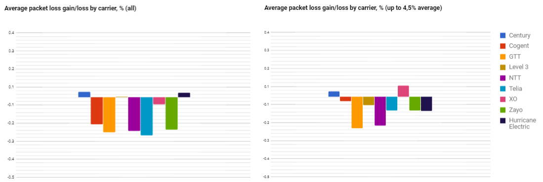
Fig. 8. Average packet loss gains/losses by carrier September 2017
Averages determined for ALL datapoints or a cutoff at 4.5% control group applied.
For October 2017, based on ALL data-points, the best positions in terms of loss were held by Centurylink and GTT, while other Tier 1s registered poorer results. Centurylink, after the cut off at 4.5% control group level has been applied, kept the same position as in the ALL data-points representation.Stable results, suggest that Centurylink has registered preponderantly lower value of loss for packets which transit it, below 4.5%. GTT, in its turn, moved to the group with worse results after we applied the cut off at the 4.5% control group level. This migration shows non-stability in the registered loss packages for this carrier. In some cases, packet loss was higher than the 4.5%.
As in September, Centurylink is present in the winner group for both graphics. GTT considerably improved its results for ALL data-points and for the applied cut off at the 4.5% control group. Level 3 worsened its statistics for ALL data-points, migrating to the loser group. Other Tier 1s kept their negative tendencies.
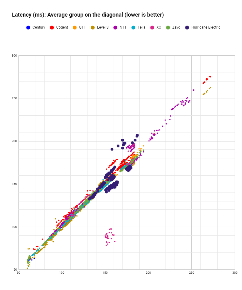
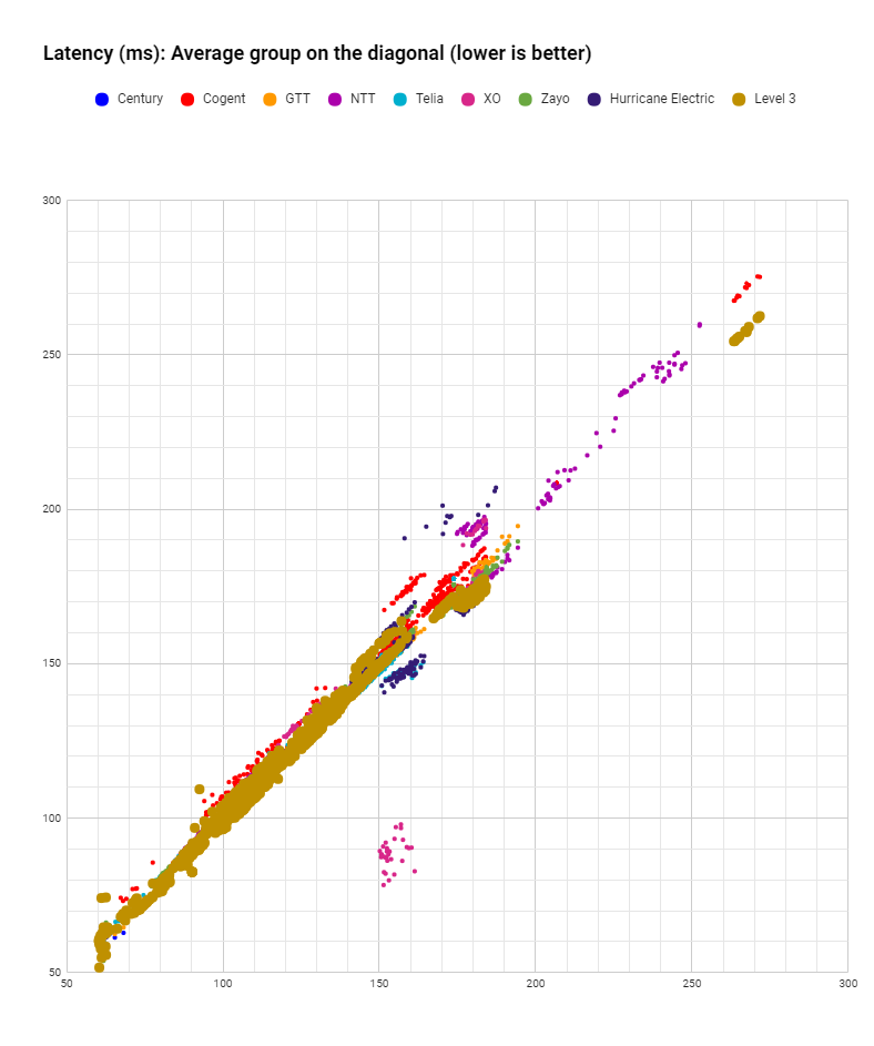
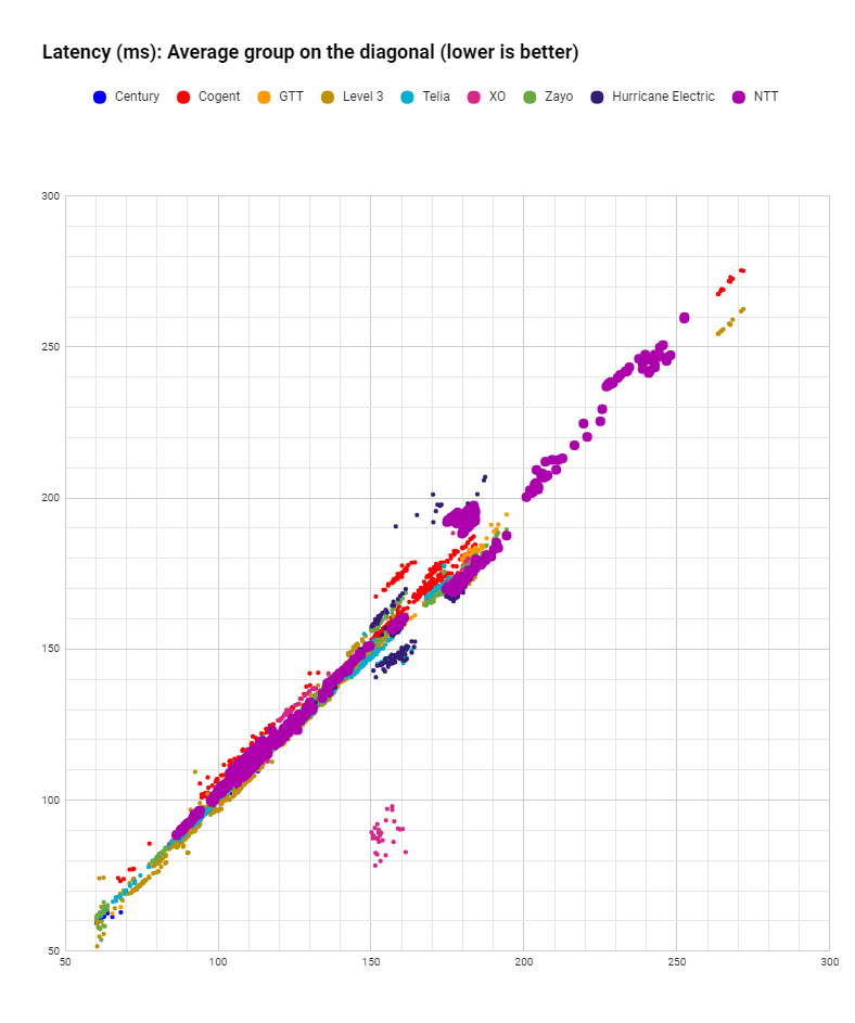
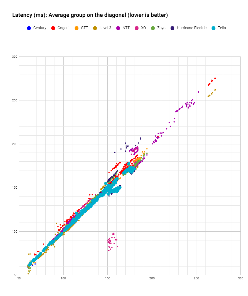
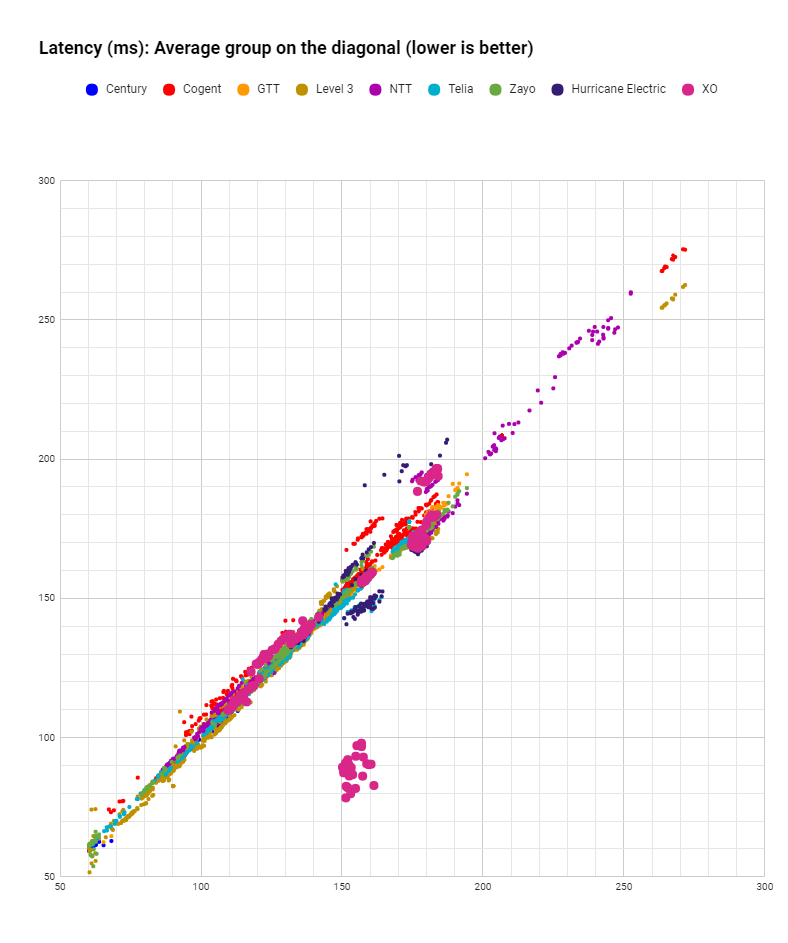
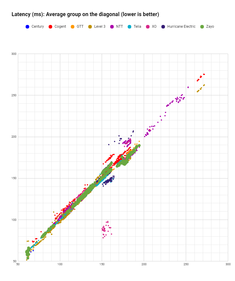
Latency
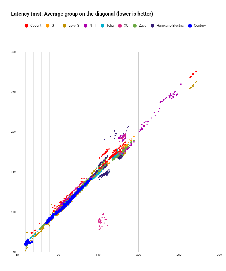
For Latency analysis we use a similar scatter plot to the one we used for Loss. It displays control group values on the diagonal while highlighting individual carrier measurements on the horizontal and on the vertical axis. Datapoints placed significantly and consistently below the average highlight better performing carriers while datapoints above the average highlight worse than average performance.
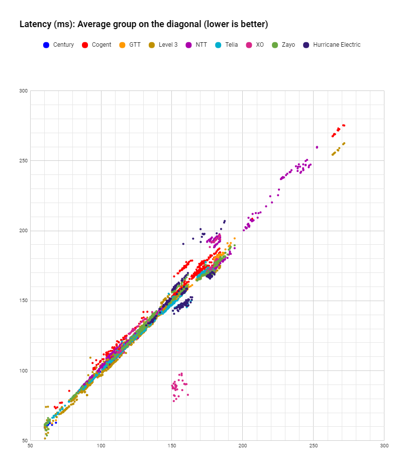
Fig. 9. Carrier latency with average group on the diagonal
Clusters of datapoints below diagonal highlight better performance
- NTT, Level 3 and Cogent registered results which depict traffic from local to very long distances (55- 280 ms);
- GTT and Zayo have been mostly present within the latency diapazon of 55 – 200 ms;
- Telia and Centurylink are spotted within the latency diapazon of 55 -170 ms;
- Hurricane Electric has been mostly registered within the 130 – 210 ms latency range.
The results above linger around the diagonal with the following observations:
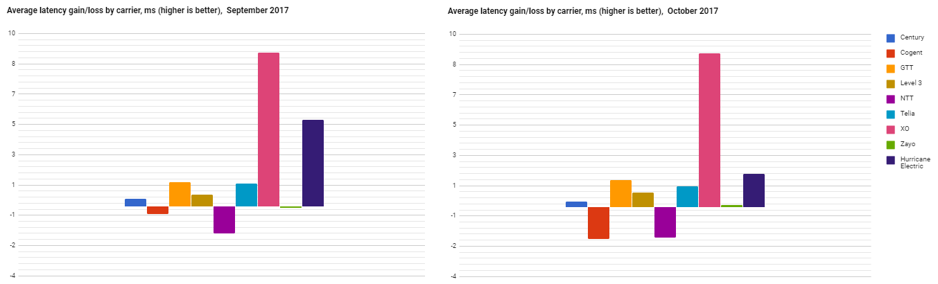
Fig. 10. Average latency gains/losses by carrier Values averaged for the difference between carrier performance and the average group in that network.
The differences in latency above from the control group are averaged with the expectation that better or worse performance will cancel out if the differences are caused by measurement noise.
The differences in latency from the control group shown above are averaged with the expectation that better or worse performance will cancel out if the differences are caused by measurement noise.
The results show that during the month of October in comparison with September the hierarchy of Tier 1s hasn’t changed:
- XO maintained the leading position, reducing its average RTT by ~8,2 ms. Hurricane Electric improved its average latency for each packet by ~ 1,4 ms, GTT and Telia reduced average RTT by ~1ms;
- Cogent and NTT increased its average latency for each packet by ~1,8 ms in comparison with the control group level.
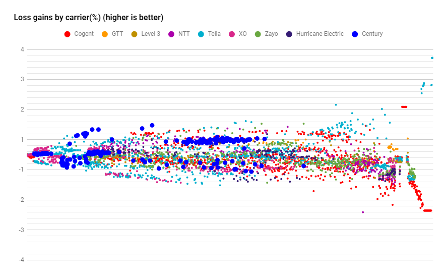
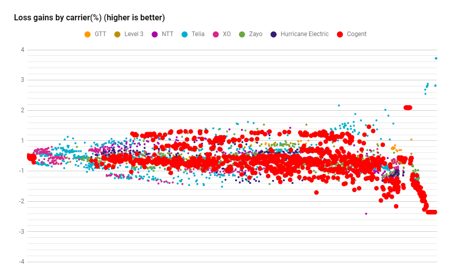
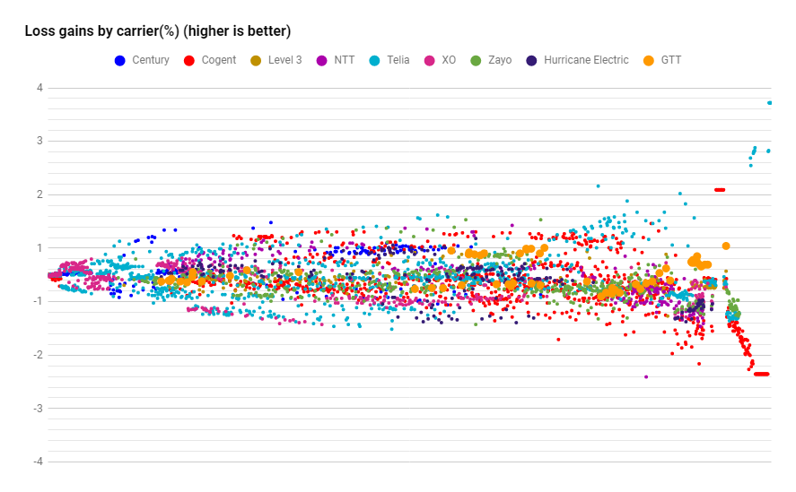
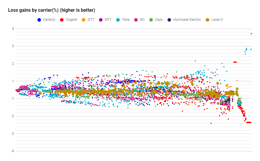
Appendix. Carrier Loss (highlighted)
Loss improvement/worsening highlighting Centurylink datapoints.
Loss improvement/worsening highlighting Cogent datapoints.
Loss improvement/worsening highlighting GTT datapoints.
Loss improvement/worsening highlighting Level 3 datapoints.
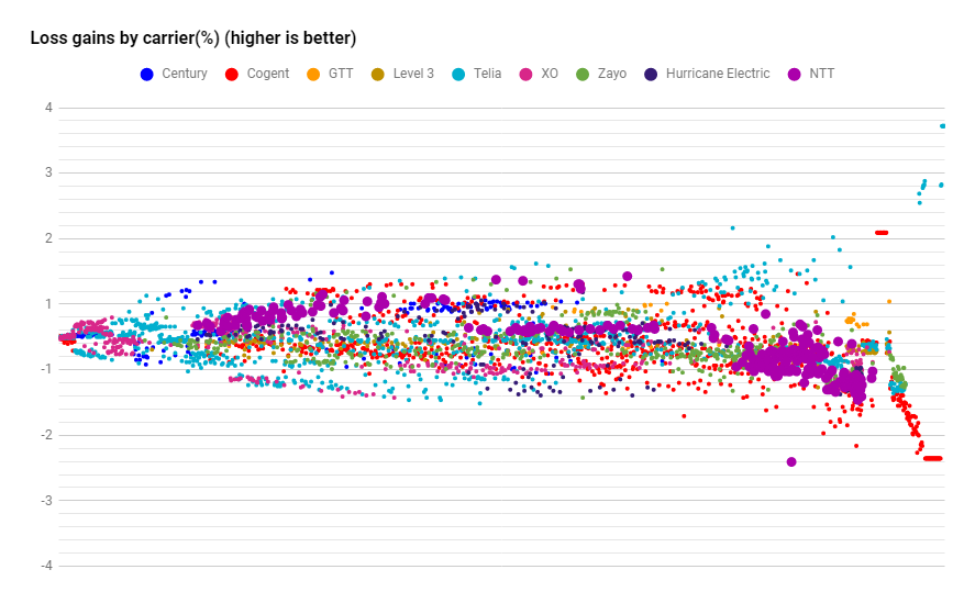
Loss improvement/worsening highlighting NTT datapoints.
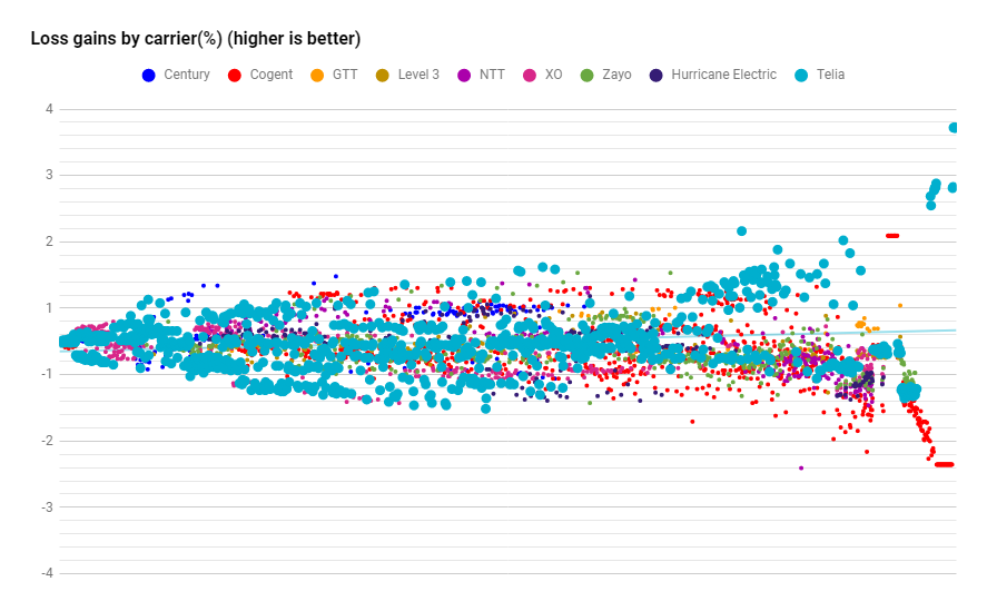
Loss improvement/worsening highlighting Telia datapoints.
Loss improvement/worsening highlighting XO datapoints.
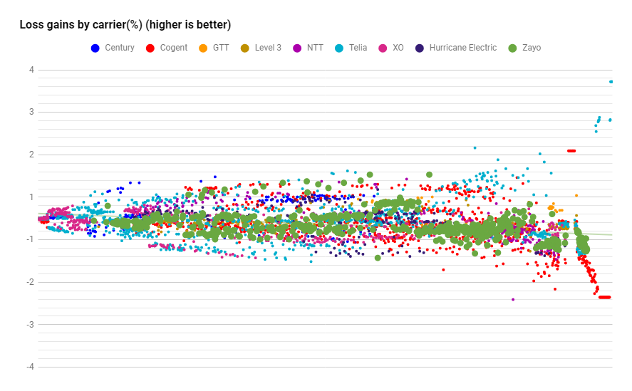
Loss improvement/worsening highlighting Zayo datapoints.
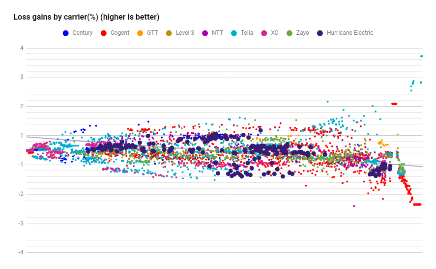
Loss improvement/worsening highlighting Huricane Electric.
Appendix. Carrier Latency (highlighted)
Latency spread chart highlighting Centurylink.
Latency spread chart highlighting Cogent.
Latency spread chart highlighting GTT.
Latency spread chart highlighting Level 3.
Latency spread chart highlighting NTT.
Latency spread chart highlighting Telia.
Latency spread chart highlighting XO.
Latency spread chart highlighting Zayo.
Latency spread chart highlighting Huricane Electric.