
Analysis is based on more than 375 million successful probes that span the entire month. All values are aggregated per carrier on a daily basis and each accounts for many thousands of successful probes. A control group (labeled C) is used as a base of comparison. The control group aggregates the average for all transit providers in a network, not only Tier 1 carriers.
Averages
Overall averages were determined based on US wide networks which concentrate most of their traffic in the continental part of the US. Specific for these networks are the similarities in presented latency values and their positioning in a “middle group”. The exclusion of infrequent datapoints from the report minimises the possibility to skew the final average values, but without 100% coverage, there is always a possibility that values don’t reflect the full reality and these results and numbers should be used as an indicator only.
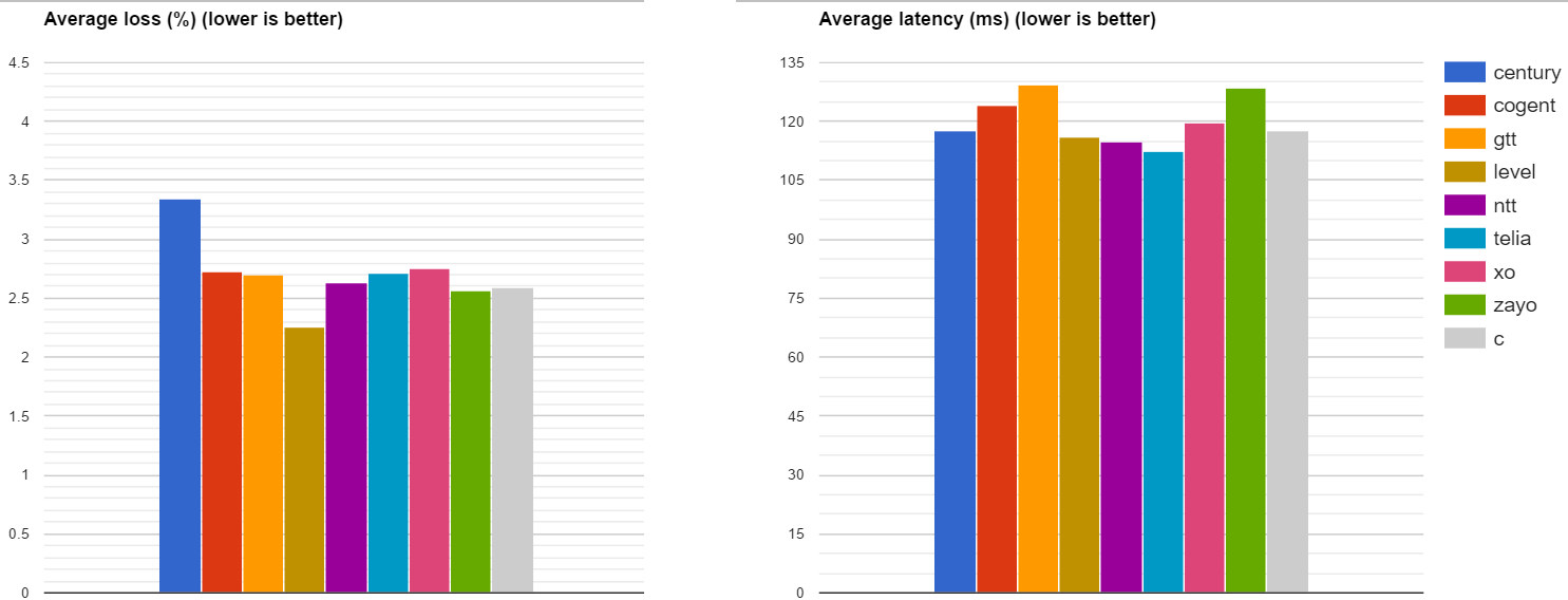
Fig. 1. Average Loss and Latency. (February 2017)
The numbers include a control group C (gray) to allow cross comparison.
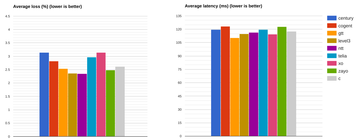
Fig. 2. Average Loss and Latency. (January 2017)
The charts include a control group C (gray) to allow cross comparison.
The latency data stayed consistent in February 2017 as compared to January 2017. Loss on the other hand improved for some tier 1 carriers with the overall averages going down. Level 3 is yet again the best performer. Also, NTT and Telia improved in February in comparison with the control group average Latency. All the carriers lingered around the control group average and we need to further compare the differences to spot whether they are better or worse. The following charts highlight the differences in average Loss and Latency from the control group.
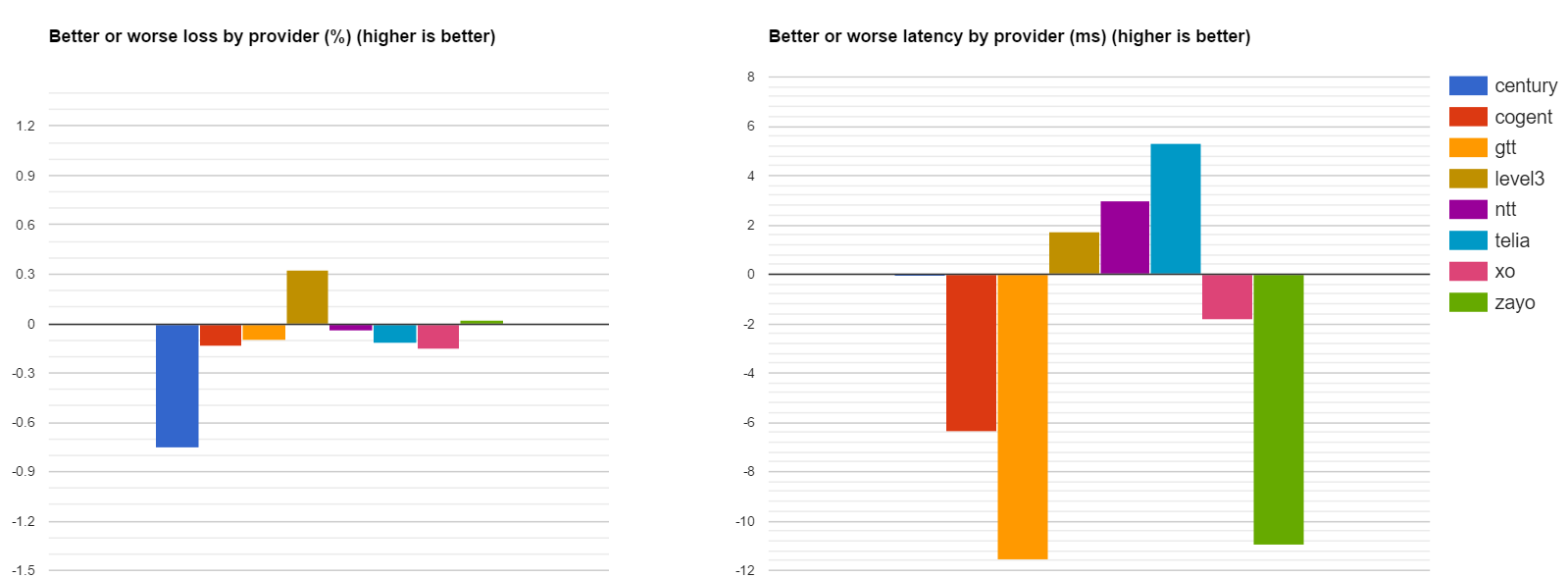
Fig. 3. Better or worse Loss and Latency in February 2017
The numbers are differences from average control group.
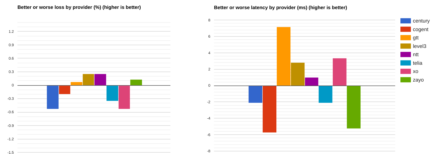
Fig. 4. Better or worse Loss and Latency in January 2017
The numbers are differences from average control group.
The results above show that in February 2017:
- Level 3 keeps its better carrier designation for both Loss and Latency averages.
- CenturyLink and Cogent consistently underperform though truth be told CenturyLink improved their latency numbers visibly.
- Zayo further worsened their latency averages.
- GTT suffered a major hiccup with their averages displaying a complete reversal from last month’s advantage.
Loss
Loss analysis uses a scatter plot where average values by control group are assumed on the diagonal and the horizontal and the vertical axis highlight carrier metrics. All datapoints below the diagonal are better performing carriers and vice versa.
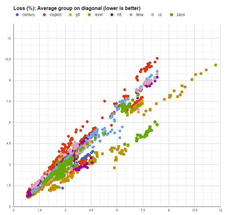
Fig. 5. Loss values spread on average diagonal
Datapoints comparison with diagonal.
Abnormally large losses are still registered for a significant number of datapoints. As was mentioned in previous reports we consider excessive an average above 4.5% packet loss.
Given the fact that Tier 1 carriers are characterized by both low loss values for some networks and abnormally high losses for other networks, the conclusion is that high loss values are not caused by the carriers themselves but rather are caused by the networks they service Or the networks they peer with. Whether the true cause is poor design, over-provisioned links or deficiencies in peering governance – this report cannot tell. What we can mention is that for many networks, whether permanently or sporadically, there is definitely an opportunity to improve things.

Fig. 6. Better or worse carrier loss (%)
Average placed on the zero line
A different representation of the above data places it around the control group (zero line) with gain values by carrier. Values are sorted and charted from left to right by increasing average loss. The chart depicts gains or worsening on a network based on the average control group’s performance – values are shown from left to right following better to worse loss values. The assumption of this analysis is that while a network’s conditions might be better or worse compared to other networks, the conditions tend to be equal across all carriers including the control group. While the carrier’s network is not the culprit causing additional loss, this analysis might be able to suggest whether those carriers peering with remote regions is deficient. Non-systemic issues with carriers will tend to cancel out with values being scattered equally above or below the zero line while systemic issues or gains will have a tendency to place a carrier consistently above or below it.
The scatter plot highlights this assumption.
More so, if we average gains or losses compared with the control group we expect the noise to cancel out.
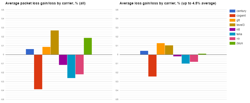
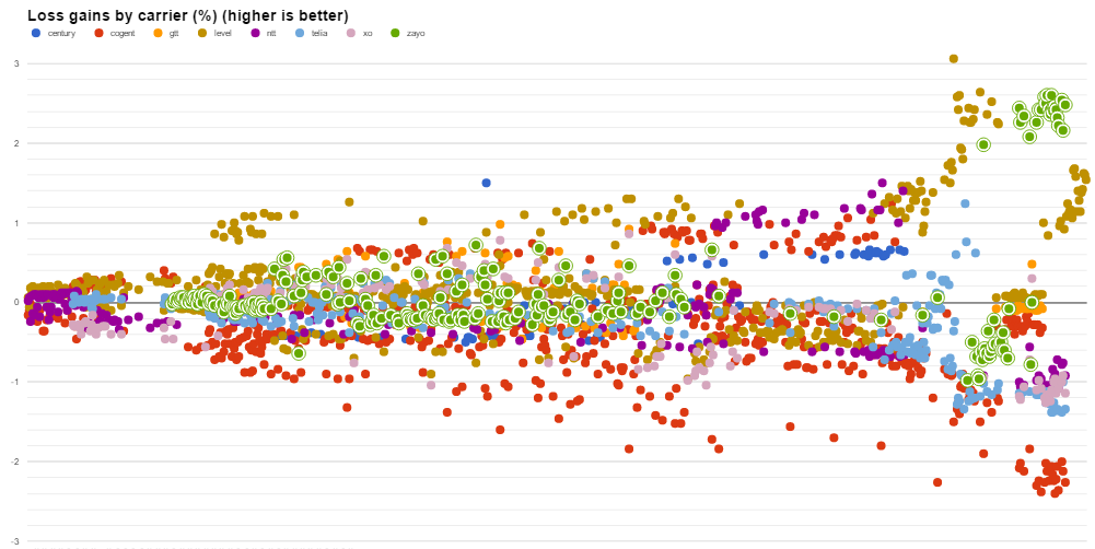
Fig. 7. Average packet loss gains/losses by carrier (February 2017)
Averages determined for ALL datapoints or a cutoff at 4.5% control group applied.
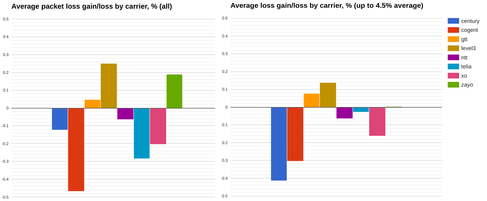
Fig. 8. Average packet loss gains/losses by carrier (January 2017)
Averages determined for ALL datapoints or a cutoff at 4.5% control group applied.
The average gains/losses brought to the table by different carriers are shown in the above charts. We include a second chart for measurements with non-excessive loss values in an attempt to avoid very large loss values in some networks to skew the results (right-hand side diagram).
The results show that Level 3 and GTT consistently bring overall better loss and latency values. Cogent, XO and Telia are consistently placed below the zero line meaning they are underperforming in comparison with the rest of the group.
Constraining the data to well performing networks has the tendency to flatten the right-side chart since all the loss values included are lower. No abnormalities to our expectations this time.
Latency
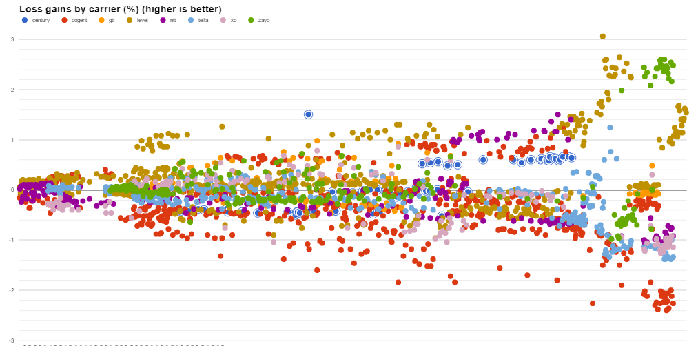
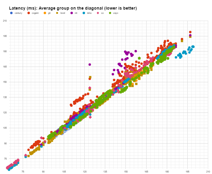
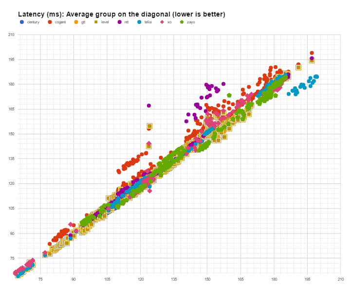
Latency analysis uses a similar scatter plot that again displays control group values on the diagonal while highlighting individual carrier measurements on the horizontal and on the vertical axis. Datapoints placed significantly and consistently below the average highlight better performing carriers while datapoints above the average highlight worse than average performance.

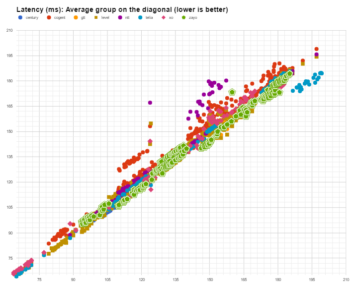
Fig. 9. Carrier latency with average group on the diagonal
Clusters of datapoints below diagonal highlight better performance
The results above linger around the diagonal with the following observations:
- Telia is present more in the right part of the graph that depicts very long haul traffic and their average latency is significantly below the average;
- Cogent and NTT data points consistently linger above the average line implying lower than average performance.
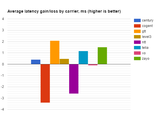
Fig. 10. Average latency gains/losses by carrier (February 2017)
Values averaged for the difference between carrier performance and the average group in that network.
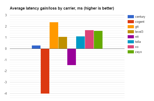
Fig. 11. Average latency gains/losses by carrier (February 2017)
Values averaged for the difference between carrier performance and the average group in that network.
The differences in latency above from the control group are averaged with the expectation that better or worse performance will cancel out if the differences are caused by measurement noise.
The results show that during February of 2017:
- Cogent adds ~3 ms to the RTT of each of the packets a network forwards through this carrier, but they still improved compared to January. NTT on the other hand worsened their outcome and added more than 2.8ms on average.
- GTT kept winning and consistently offered ~2ms gains to the average RTT with Zayo following close at almost 1.5ms gains.
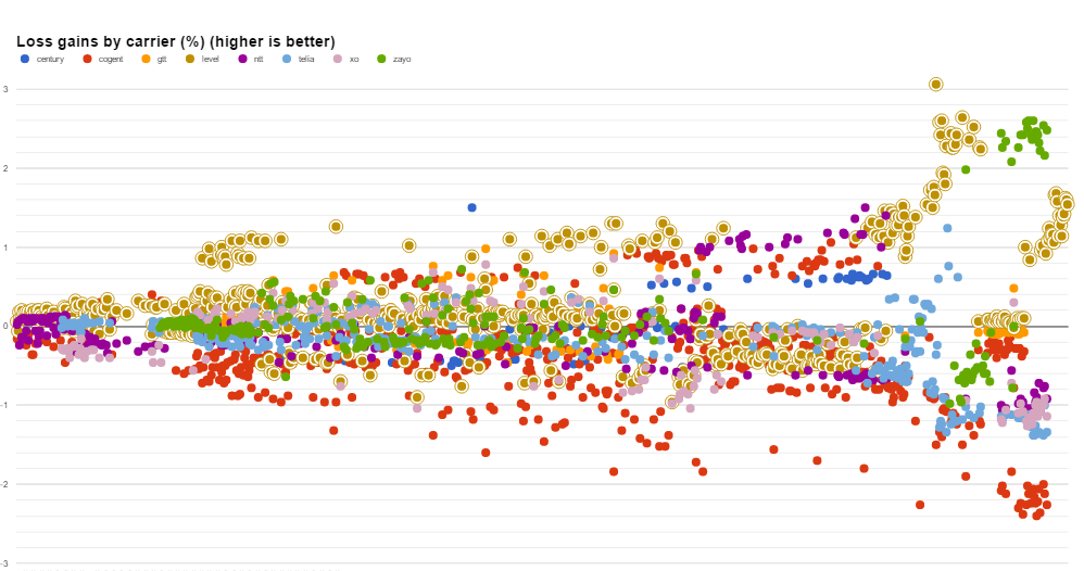
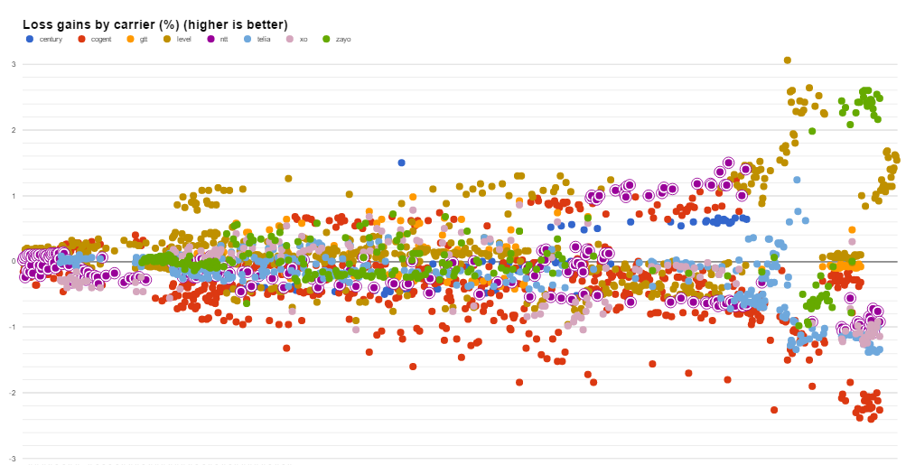
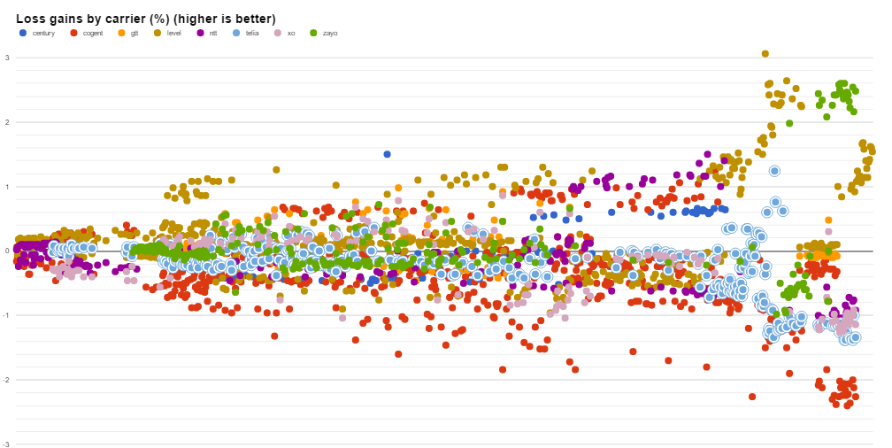
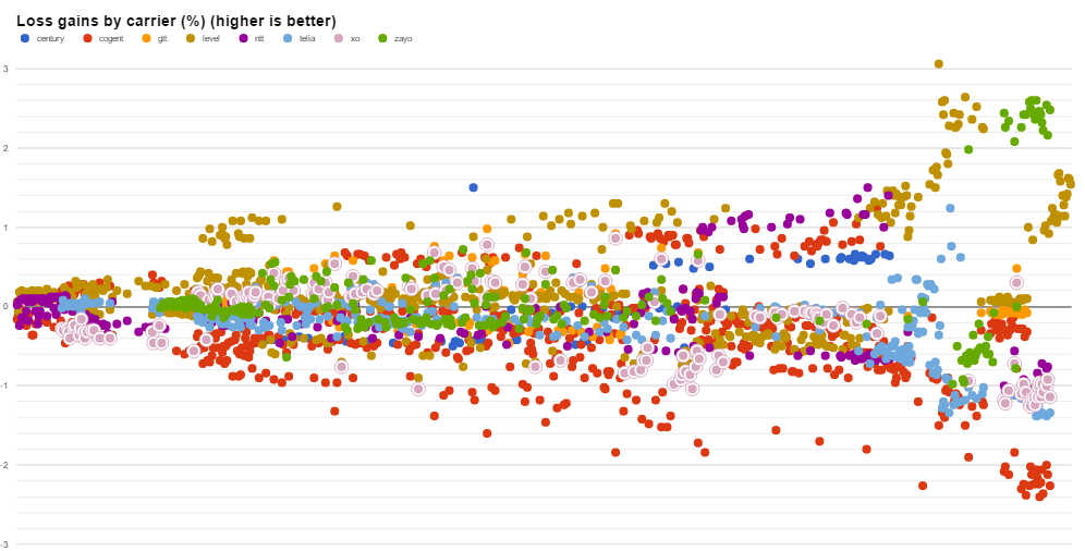
Appendix. Carrier loss (highlighted)
Loss improvement/worsening highlighting Centurylink datapoints.
Loss improvement/worsening highlighting Cogent datapoints.
Loss improvement/worsening highlighting GTT datapoints.
Loss improvement/worsening highlighting Level 3 datapoints.
Loss improvement/worsening highlighting NTT datapoints.
Loss improvement/worsening highlighting Telia datapoints.
Loss improvement/worsening highlighting XO datapoints.
Loss improvement/worsening highlighting Zayo datapoints.
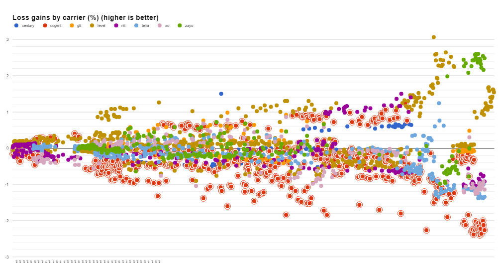
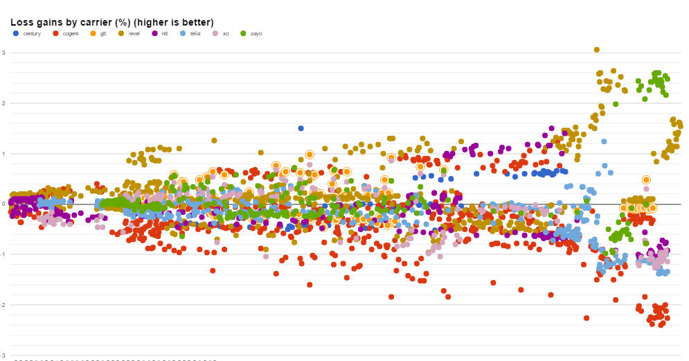
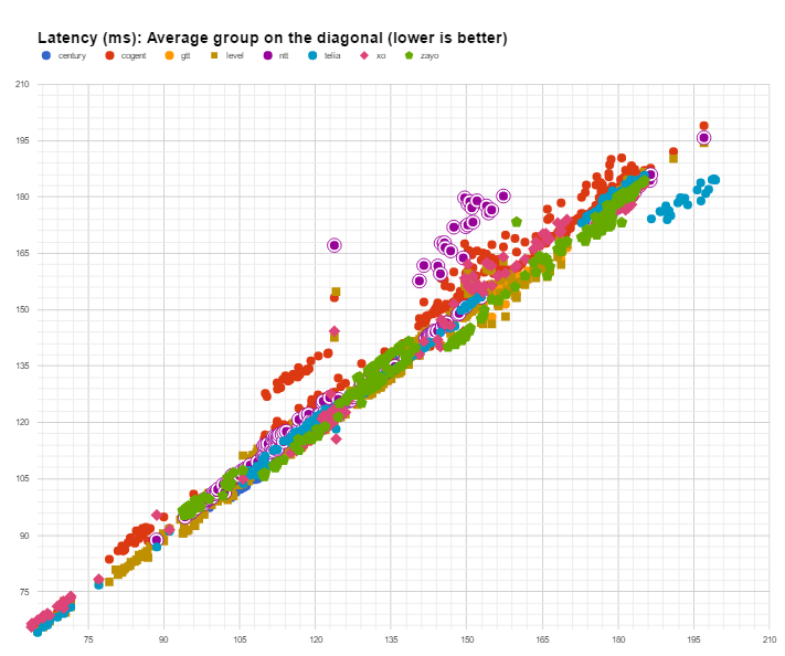
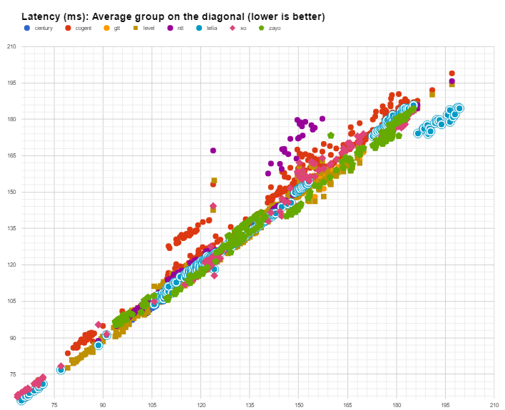
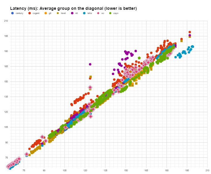
Appendix. Carrier latency (highlighted)
Latency spread chart highlighting Centurylink.
Latency spread chart highlighting Cogent.
Latency spread chart highlighting GTT.
Latency spread chart highlighting Level 3.
Latency spread chart highlighting NTT.
Latency spread chart highlighting Telia.
Latency spread chart highlighting XO.
Latency spread chart highlighting Zayo.
Disclaimer*: The data presented in this report card is intended for information purposes only and is not to be interpreted as any form of promotion or debasement for carriers herein named. Information is obtained from the Intelligent Routing Platform Lite instances, where the compulsory consent of the legal entities for collection of such information is part of the Terms and Conditions document. For privacy protection, the exact location and number of IRP Lite instances are not provided.