[vc_row][vc_column][vc_column_text] The Tier 1 Carriers Performance Monitoring Service has just been released by Noction. It is available to the general public at no cost.
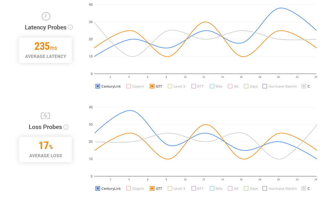
Real-time dashboards contain visualizations that are automatically updated with the most current Packet Loss and Latency data for a select group of Tier 1 network providers. These include CenturyLink, Cogent, GTT, Level 3, NTT, Telia, XO, Zayo and Hurricane Electric. Data visualizations offer a combination of historic data and real-time information that is useful for identifying emerging trends and monitoring efficiency of the above-mentioned Tier 1s.
All presented results are based on the analysis of the millions of successful probes continuously performed by Noction IRP Lite instances. Service focuses on Tier 1 carriers performance results in the US. Rare data points from distant locations e.g. Alaska or Hawaii are being omitted.
The data collection method comprises of a Netflow collector looking at destinations an installed network is speaking to and the explorer component then performing periodic probing via ICMP, UDP, and TCP_Syn, checking the performance metrics. The Tier 1 ISPs average Packet Loss and Latency data are well sampled, as most of the IRP Lite enhanced networks are typically speaking to around a third of the routing table each day.
We combat bias by collecting and utilizing the types of data mentioned above as opposed to third-party surveys or the information provided by the Tier 1 network providers themselves.
Seeing is Believing – understanding the graphs.
Before you get started reviewing data, it’s important to understand what the offered graphs actually mean. Here are a few helpful tips.
How information is presented:
The main menu allows you to select the level of data aggregation, a preferred time interval and time zone (PST or UTC) as well as an option to provide us with your valuable feedback.
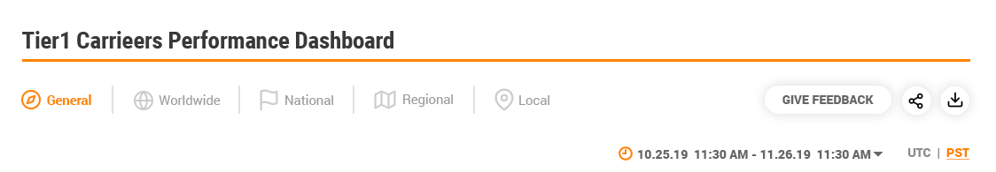
The top graphs represent a detailed view of the average latency and packet loss values for a specifically selected provider(s) over a chosen time interval. Each network provider is represented by a line of particular color. A control group (labeled C) is used as a base for comparison. This group aggregates the average for all transit providers in a network, including Tier 1 carriers. The default view offers Latency and Packet Loss results for the best performing carrier in terms of loss within the last hour.
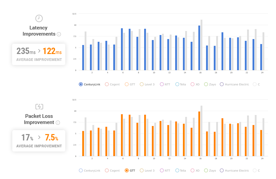
The bottom charts present the average latency and loss values for a specifically selected provider(s) as well as the impact of the Intelligent Routing Platform actions when automatically optimizing traffic for our customers.
What can one use this real-time dashboard for?
Internet Latency and Packet Loss sensitive organizations operate in dynamic environments which produce operational challenges that must constantly be resolved. Each millisecond added to RTT can mean losses in profits or reputation.
Our online service offers network professionals a first-hand view into both historic and real-time performance of specific Network Providers. The information can be used as a trustworthy reference when negotiating and/or developing a mature multihoming strategy for your Internet Connectivity.[/vc_column_text][/vc_column][/vc_row]