The analysis cover widely used Tier 1 carriers and is limited to only the US for now. Datapoints that appear rarely, like data from Alaska have been removed as unreliable.
The results are based on approximately 100 million successful probes that span over a week. All values are aggregated per carrier on a daily basis and each accounts for many thousands of successful probes. An average control group is identified and it aggregates probing data from all other transit providers, not only Tier 1 carriers.
Averages
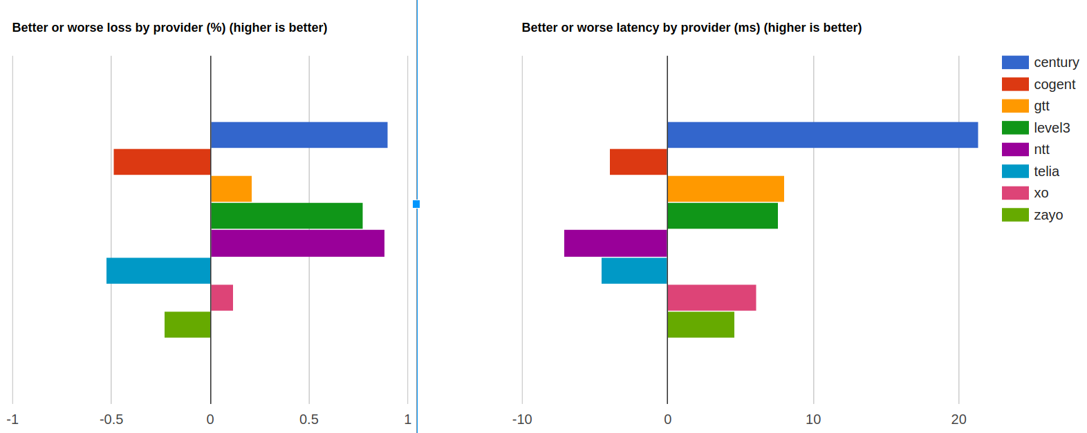
Let us start with overall averages.
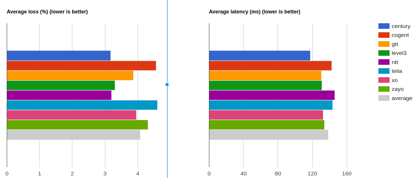
The graphs are self explanatory, but as you can see, Centurylink appears to perform best for both loss and latency reasons, with Level 3 not far behind.

The observations are:
- Centurylink, trailed by Level 3 and GTT, offer over the board latency and loss gains
- Telia and Cogent bring to the table worse than average latency and loss
- NTT and Zayo offer mixed results – while offering gains on one, they worsen the other
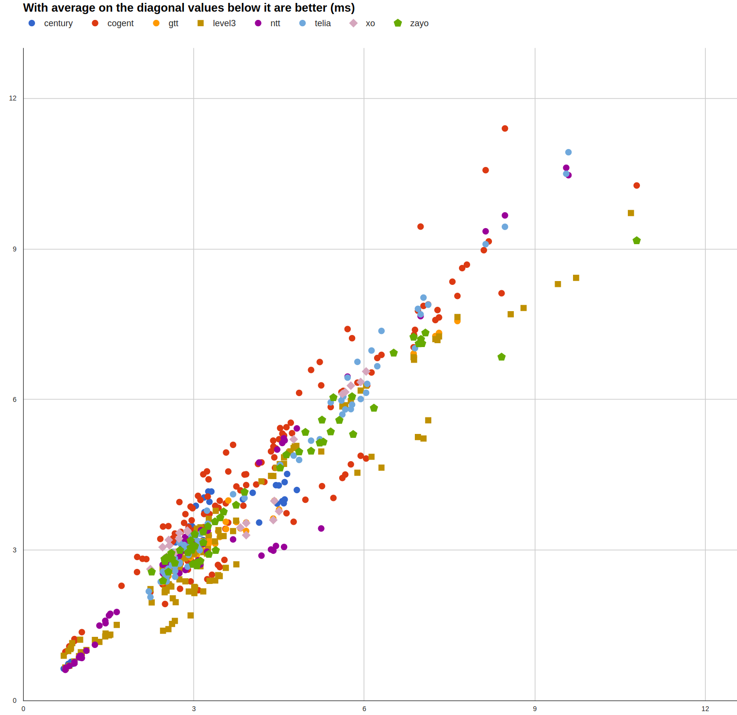
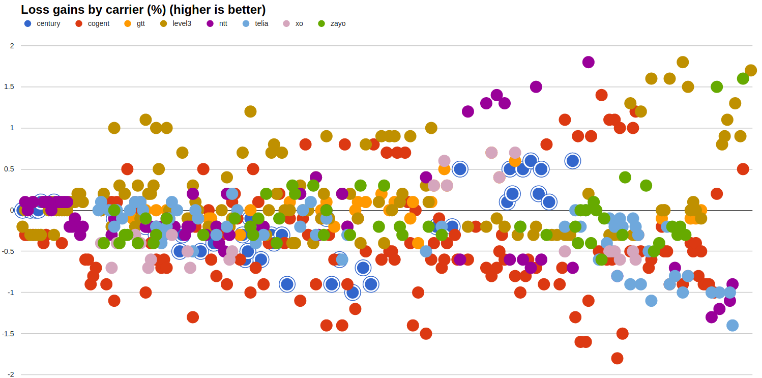
Loss
By displaying average value on the diagonal, we can review and identify outliers. Datapoints significantly and consistently below the average highlight better performing carriers, while datapoints above highlight worse than average performance.

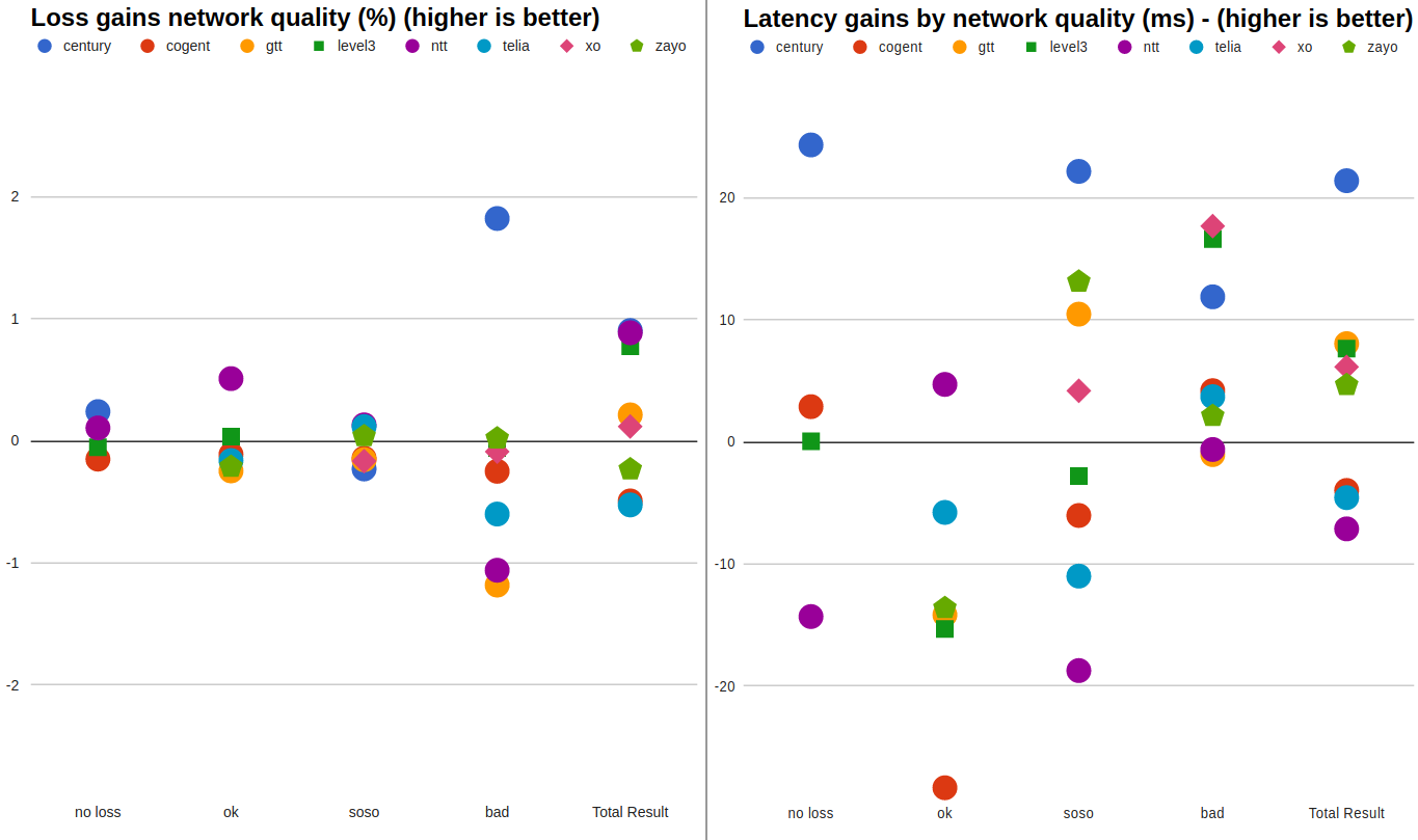
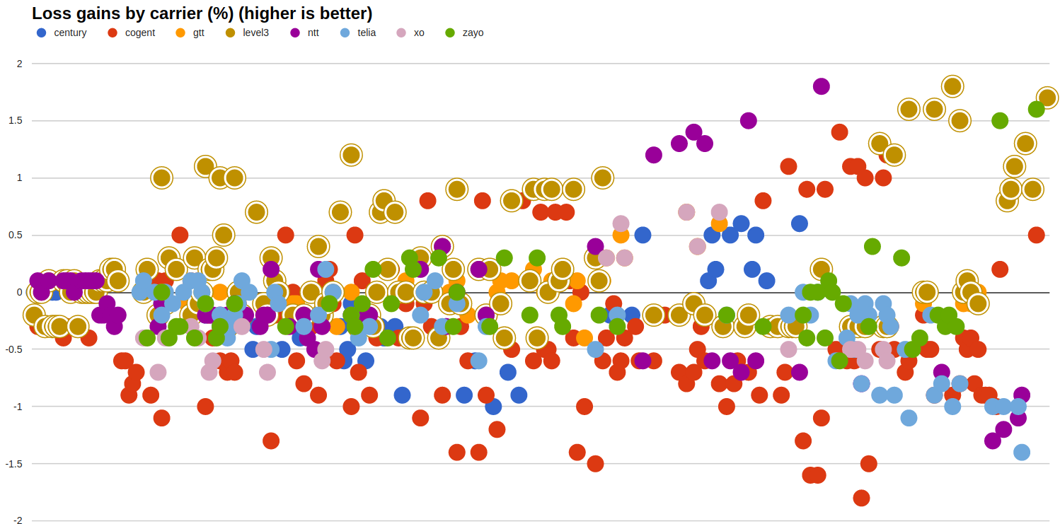
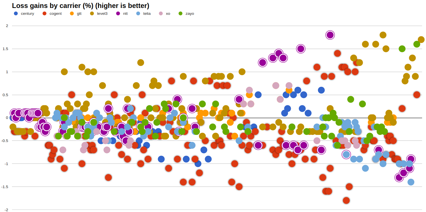
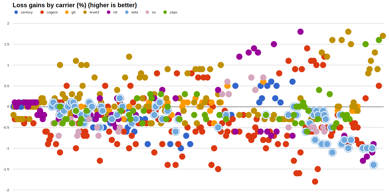
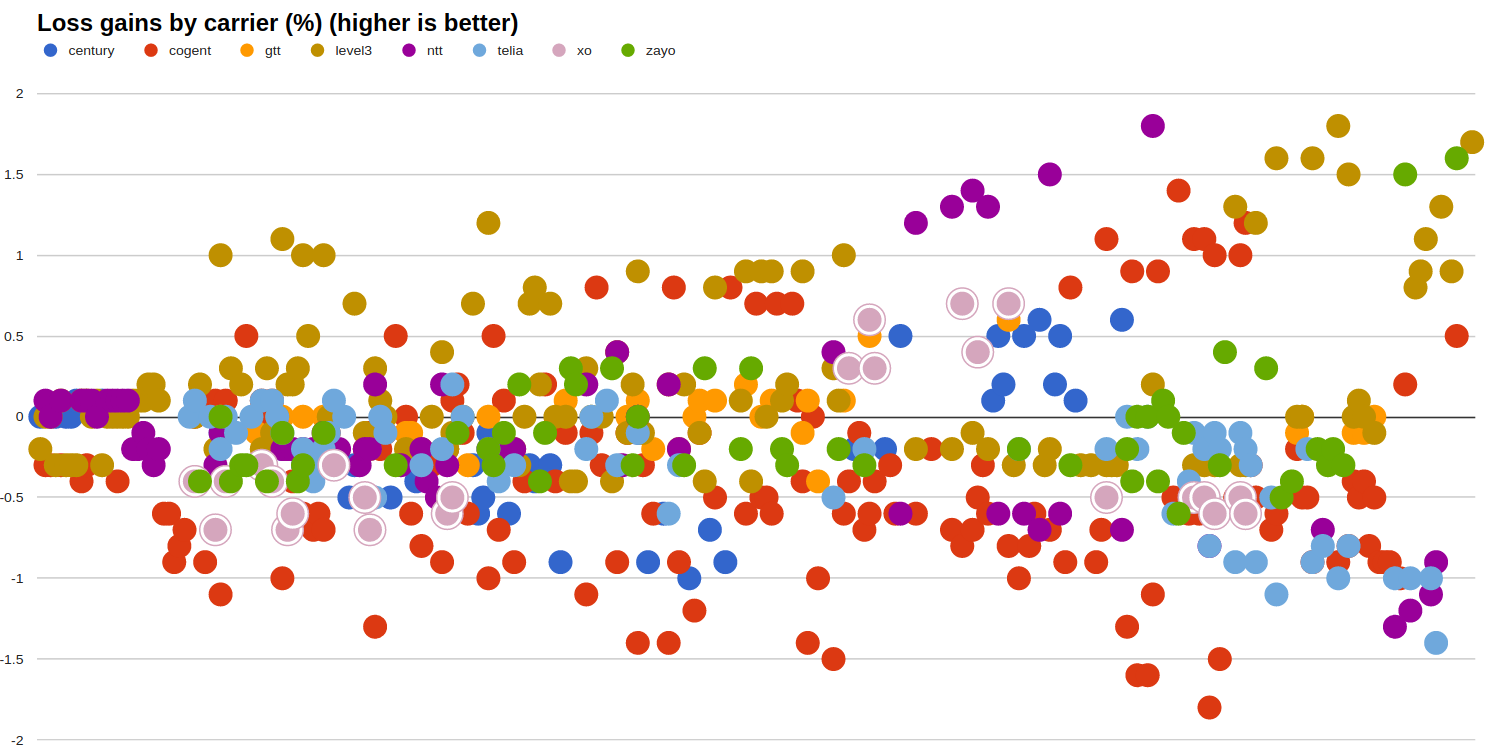
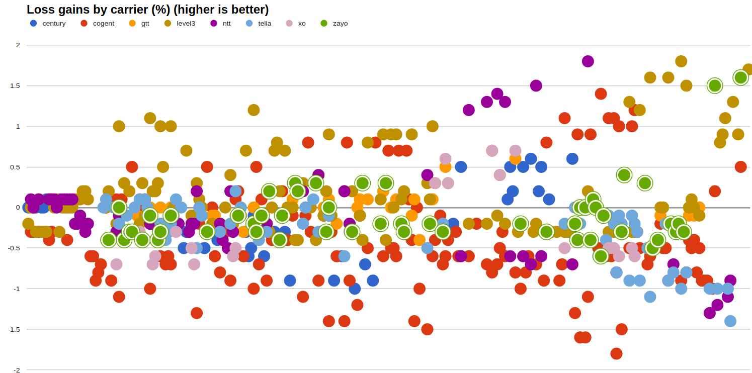
Now we will look at different representation of the above data around the average (zero line), with gain values by carrier. Values are shown from left to right by average loss. Bigger dots are used so that carrier colors dominate one or another area of the chart.
The graphs confirm the initial finding that Level 3 and Centurylink offer loss gains. This is true for both the left side and right side of the graph. Less so for NTT, which has some significant worsening to the far right of the spectrum.
While Cogent has some gains most of the time, much like Telia, it is listed with worsened loss.
See appendixes that highlight individual carriers on this graph.
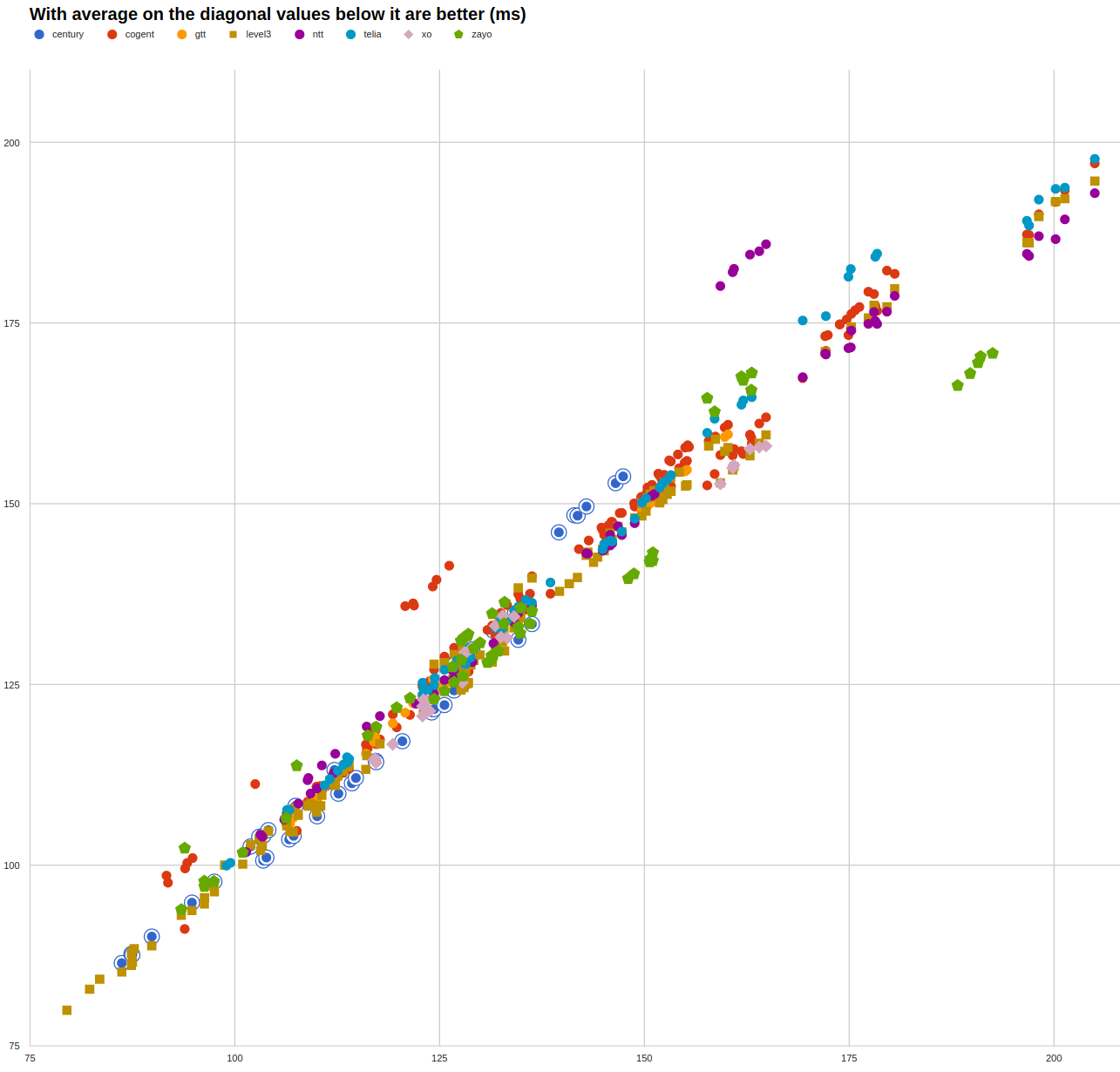
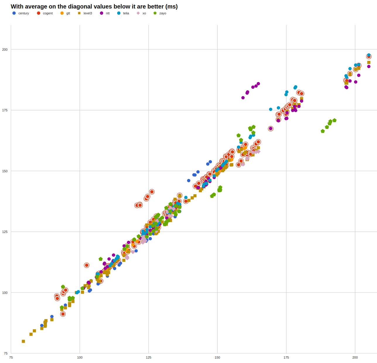
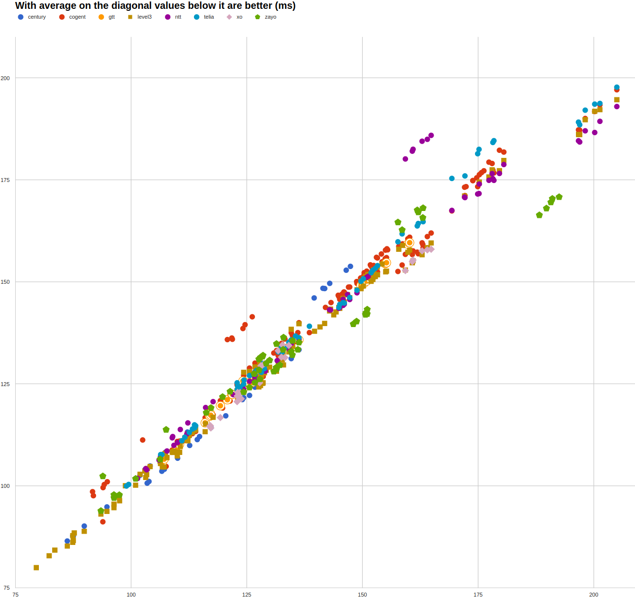
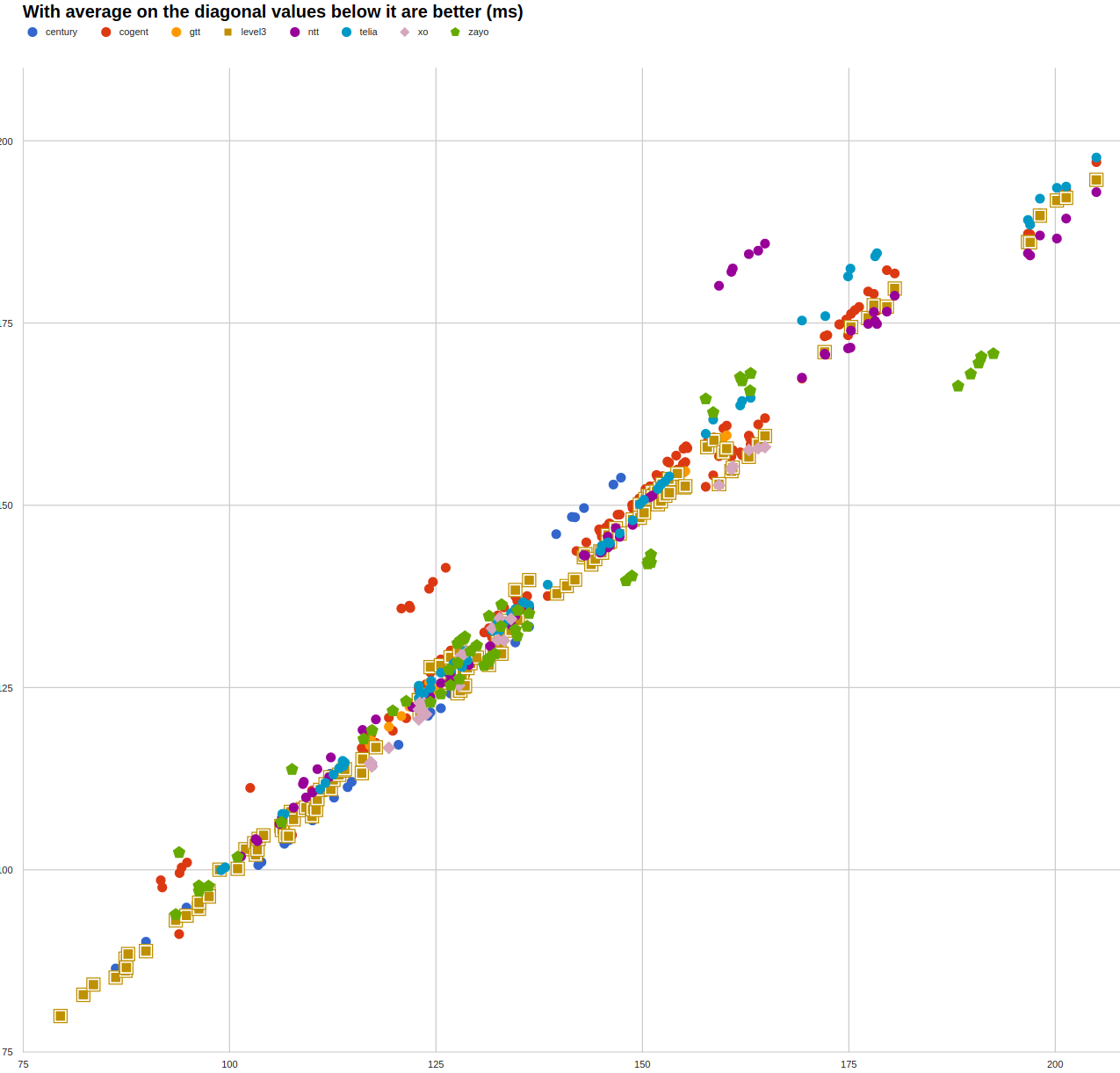
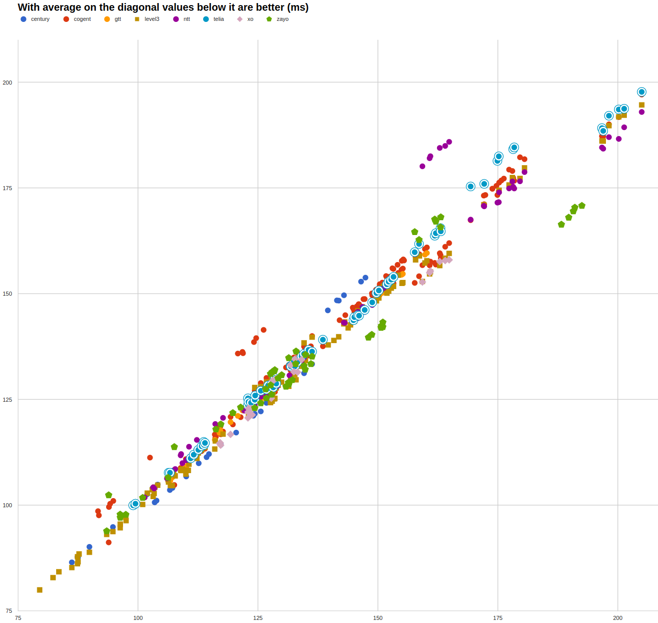
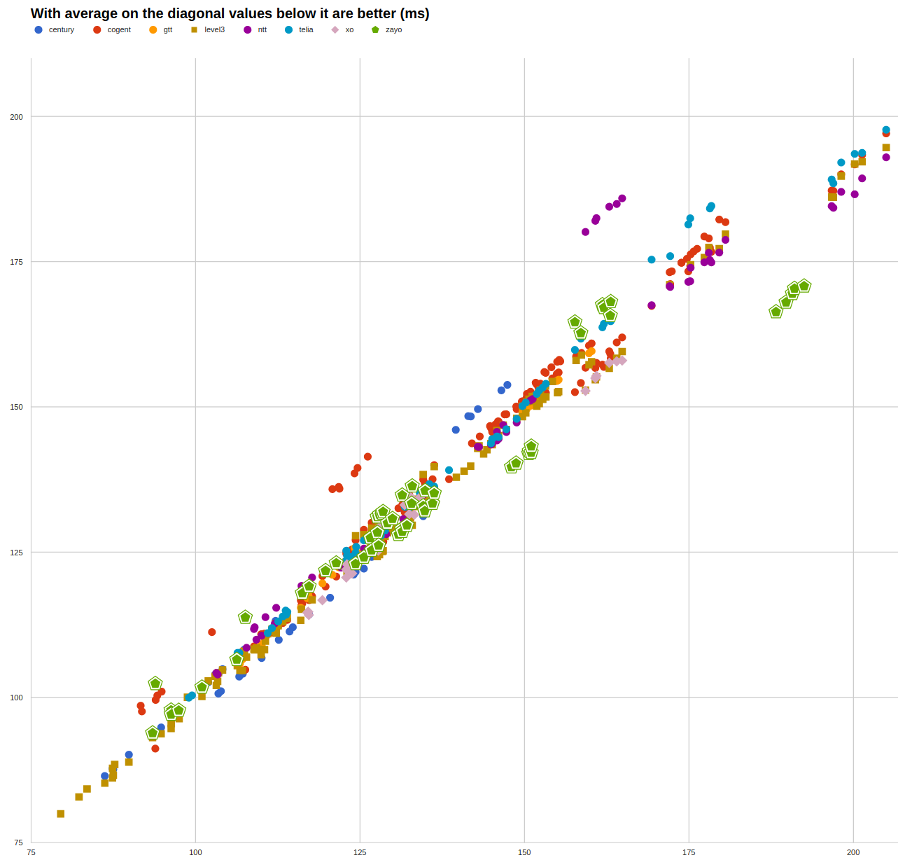
Latency
By displaying average value on the diagonal we can review and identify outliers. Datapoints significantly and consistently below the average highlight better performing carriers while datapoints above highlight worse than average performance.
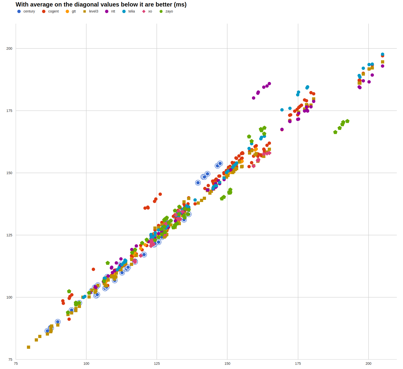
The results above highlights that for long-haul traffic – with network average RT above 175ms – most Tier 1 carriers offer significantly better service. Of course, the benefits can be realized if significant volumes of traffic indeed target global audiences.
Other than that a few carriers, for example the already mentioned Centurylink, follow the general trend but most of the time consistently below the average line. This allows them to score a significant latency gain in comparison with other carriers.
Additionally Cogent and NTT seem to be consistently placed above the diagonal that indicates a poorer than average latency.
This data follows a better trend and there is no need to find other representations. See appendixes that highlight individual carriers.
Appendix – Lossy networks bias
To appease concerns that data has been collected in heterogenous networks and the blame stays with those networks being poorly operated we’ve split the different networks by loss levels where we consider networks with average loss levels into the following categories:
- No Loss networks are those networks that register loss levels at 1.5% and below.
- Ok loss levels are registered for networks operating between 1.5 and 2.5%.
- So-So loss levels are considered values between 2.5 and 4.5%
- Bad loss is considered average loss above 4.5%
The argument brought forth is that if similar values are registered across the full full range of networks then the average values above are conclusive and gains or degradation in performance depends on the Tier 1 carriers used.
Due to unexpectedly high loss values we’ve decided to verify our claims by excluding those as exceptional and introducing a very large uncertainty and measurement bias to the overall average values.
Gains for adjusted (above) vs original (below) data
The same observations hold as in the initial results.
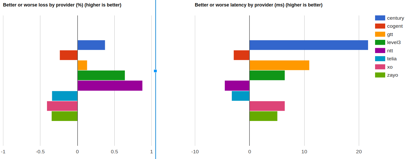
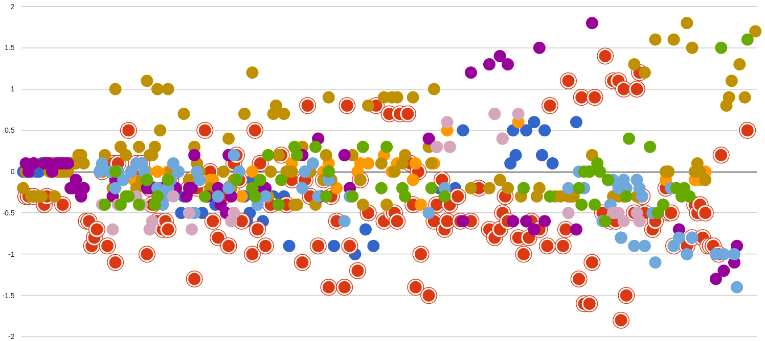
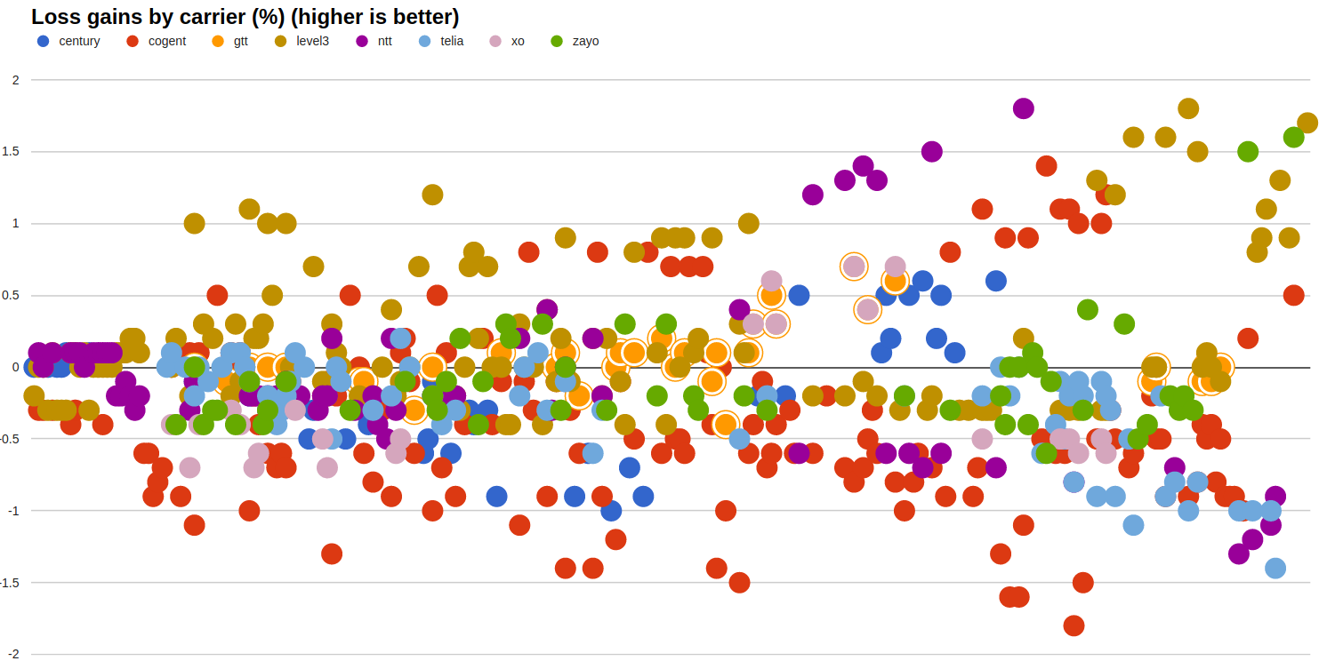
Appendix. Carrier loss (highlighted)
Appendix. Carrier latency (highlighted)