Understanding BGP states is essential to grasp how BGP operates. Similar to interior...


Request a personalized demo/review session of our Intelligent Routing Platform

Evaluate Noction IRP, and see how it meets your network optimization challenges

Schedule a one-on-one demonstration of our network traffic analysis product

Test drive NFA today with your own fully featured 30-day free trial
The presented analysis is based on more than 713 million successful probes that span the entire month. All data is aggregated per carrier on a daily basis and accounts for many thousands of successful probes. A control group (labeled C) is used as a base of comparison. The control group aggregates the average for all transit providers in a network, including Tier 1 carriers.
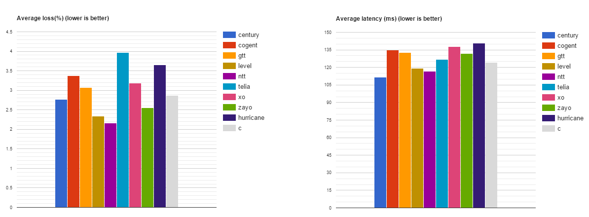
Fig. 1. Average Loss and Latency in April 2017
The numbers include a control group C (gray) to allow cross comparison.
The values for March 2017 are included for cross comparison.
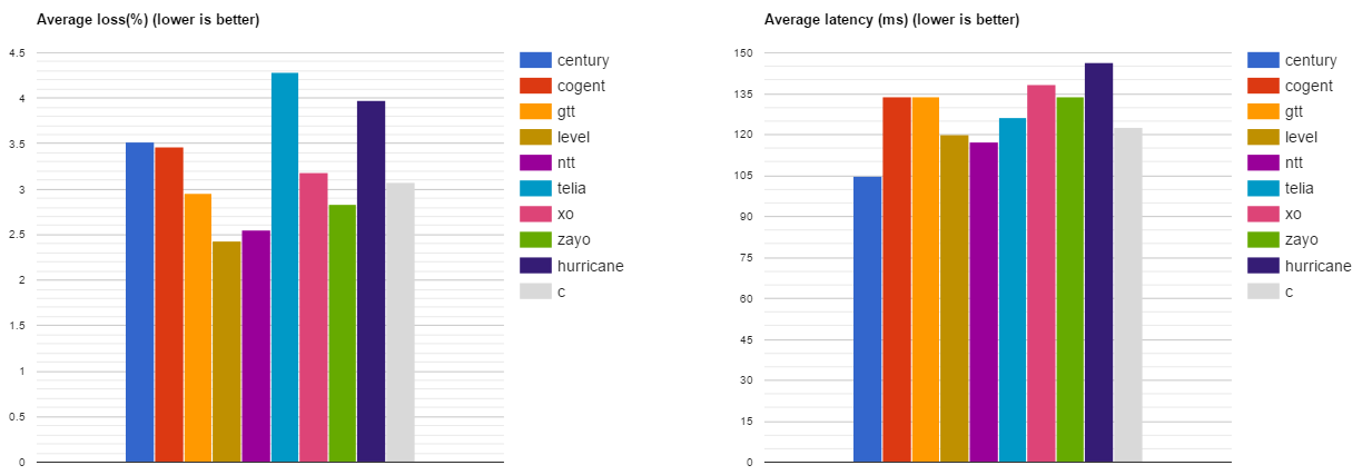
Fig. 2. Average Loss and Latency in March 2017
The charts include a control group C (gray) to allow cross comparison.
Average packet loss analysis:
When generalizing all registered results, the following can be concluded: average packet loss in April was lower than March for most of the analyzed Tier 1 carriers.
Average latency analysis:
The charts below illustrate the performance of each carrier in comparison to the control group.
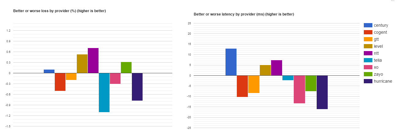
Fig. 3. Better or worse Loss and Latency in April 2017
The numbers are differences from average control group.
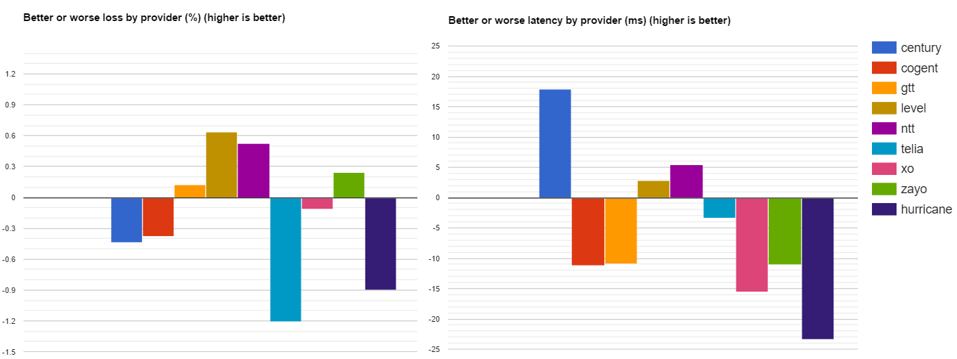
Fig. 4. Better or worse Loss and Latency in March 2017
The numbers are differences from average control group.
In comparison with the control group for the month of April, 2017:
In comparison with the data from March, 2017:
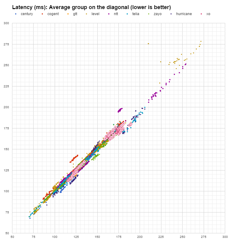
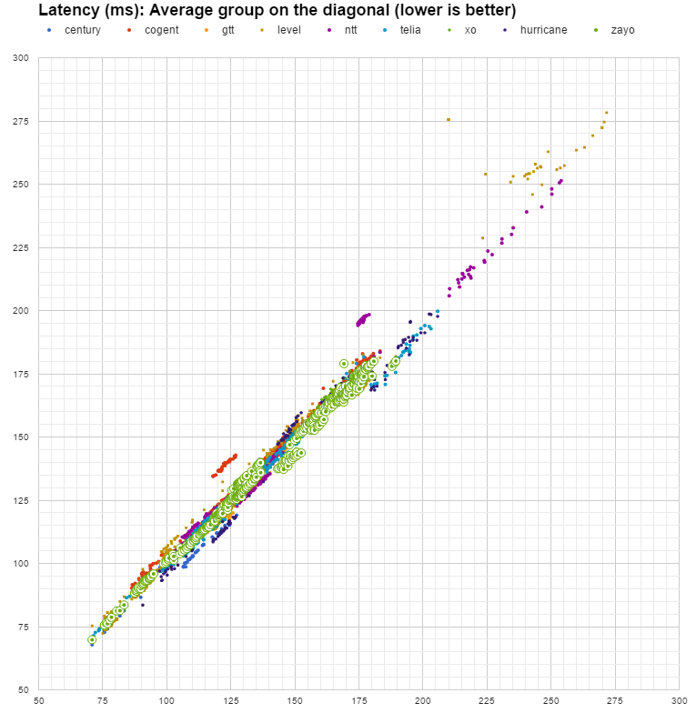
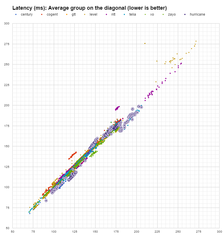
For the Loss analysis we use a scatter plot, where average values by control group are assumed on the diagonal while the horizontal and the vertical axis highlight carrier metrics. All datapoints below the diagonal represent the better performing carriers and vice versa.
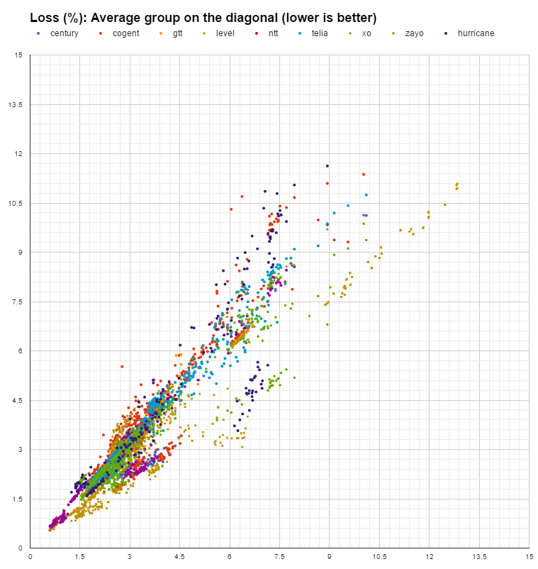
Fig. 5. Loss values spread on average diagonal
Datapoints comparison with diagonal.
Abnormally large losses are still registered for a large number of datapoints. As was mentioned in previous reports we consider excessive an average above 4.5% packet loss.
Given the fact that Tier 1 carriers are characterized by both low loss values for some networks and abnormally high losses for other networks, the conclusion is that high loss values are not caused by the carriers themselves but rather are caused by the networks they service Or the networks they peer with. Whether the true cause is poor design, over-provisioned links or deficiencies in peering governance – this report cannot tell. What we can mention is that for many networks, whether permanently or sporadically, there is definitely an opportunity to improve things.
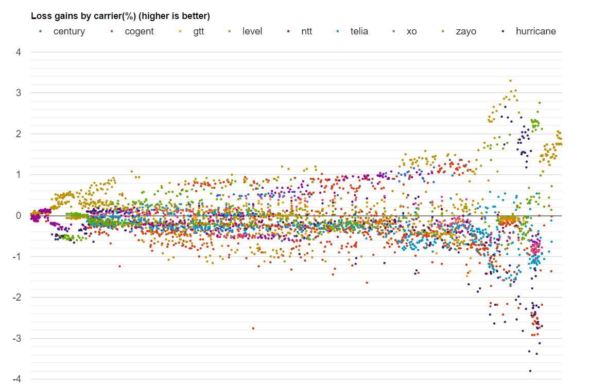
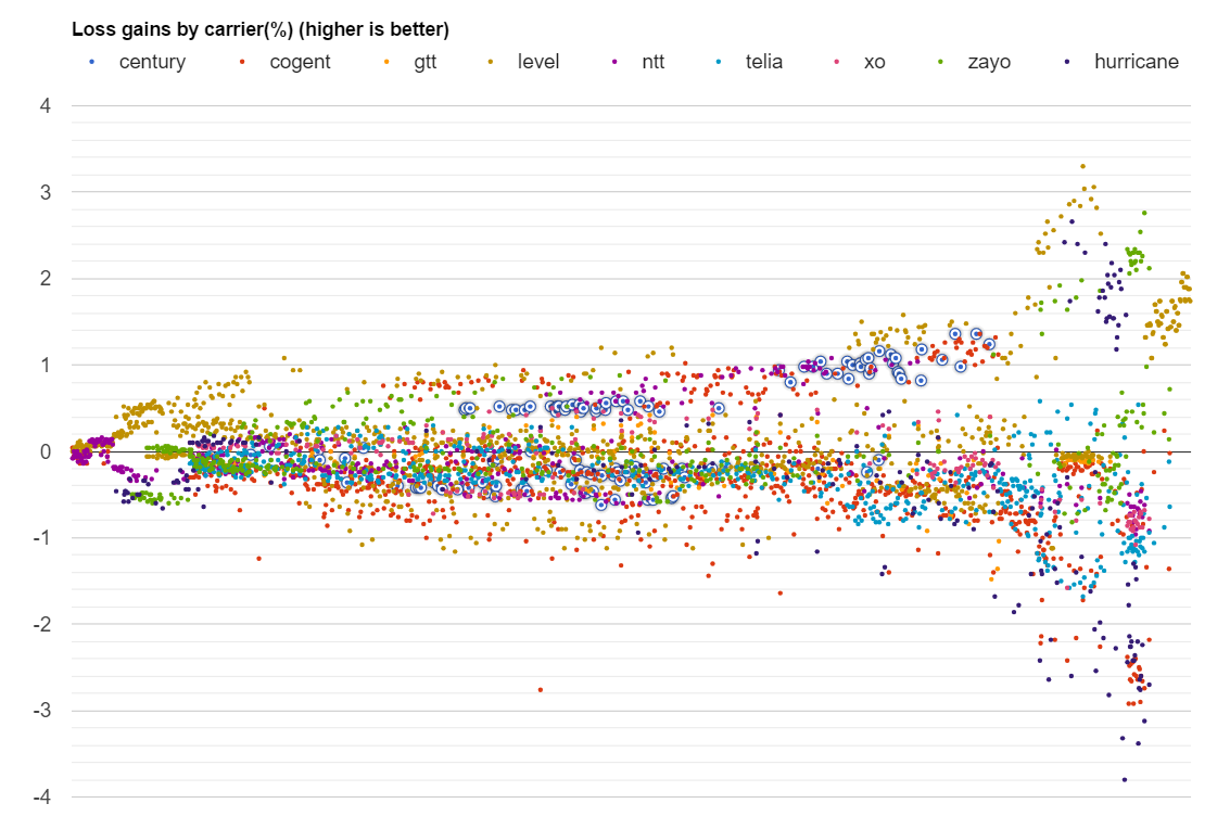
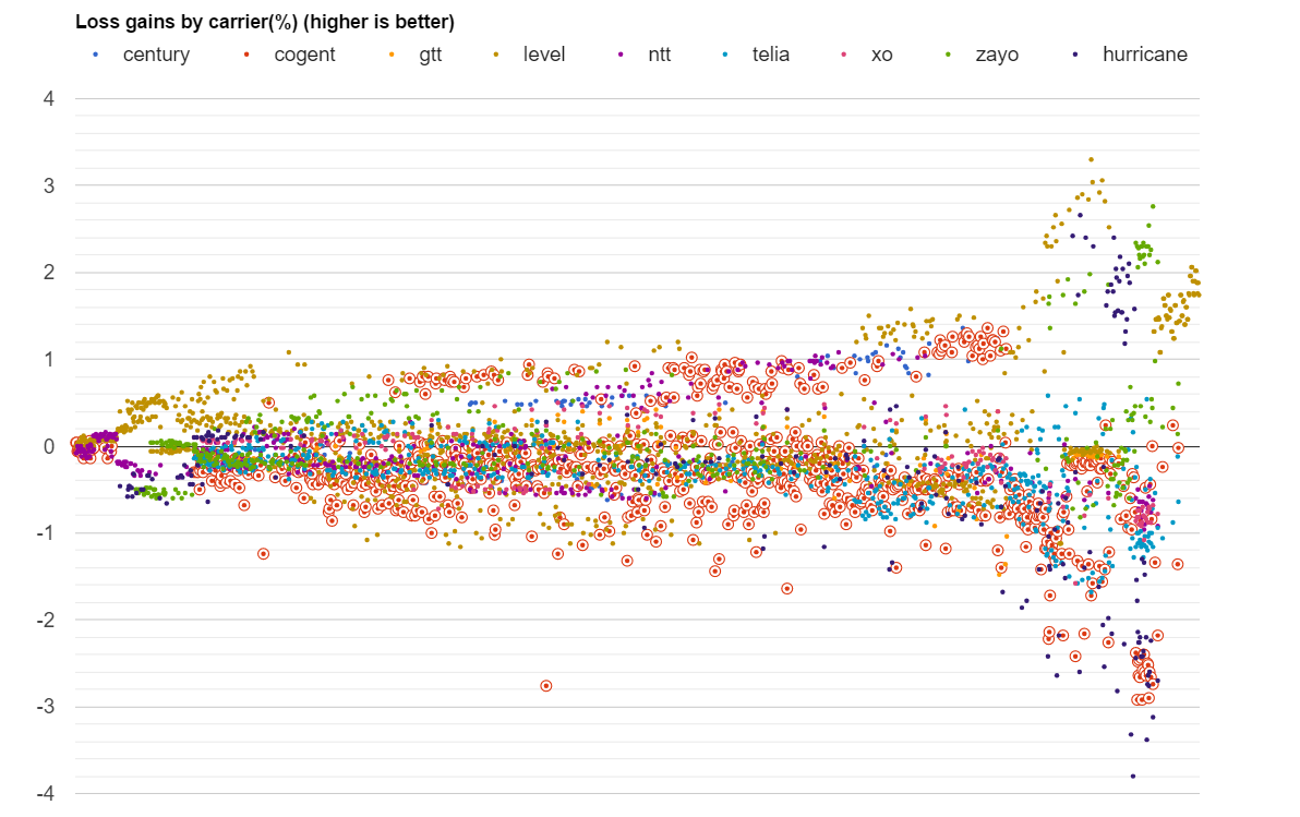
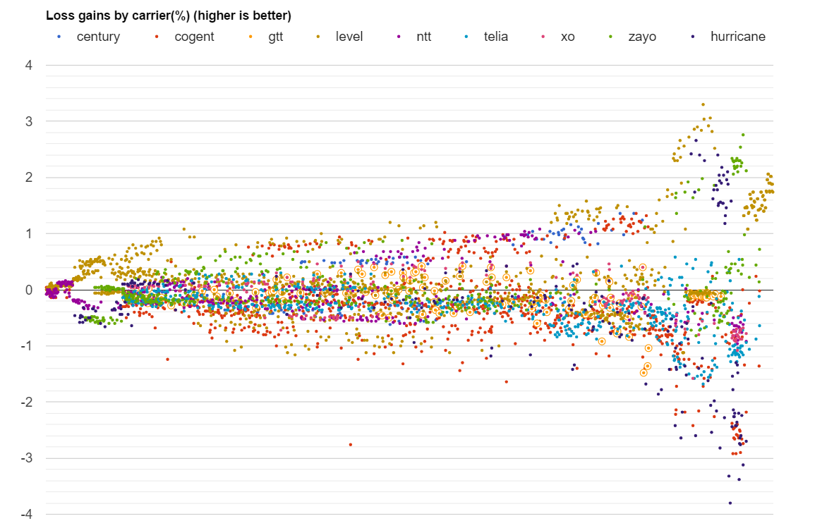
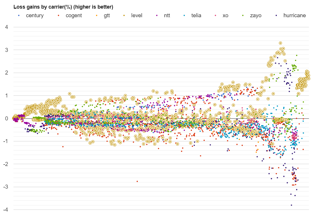
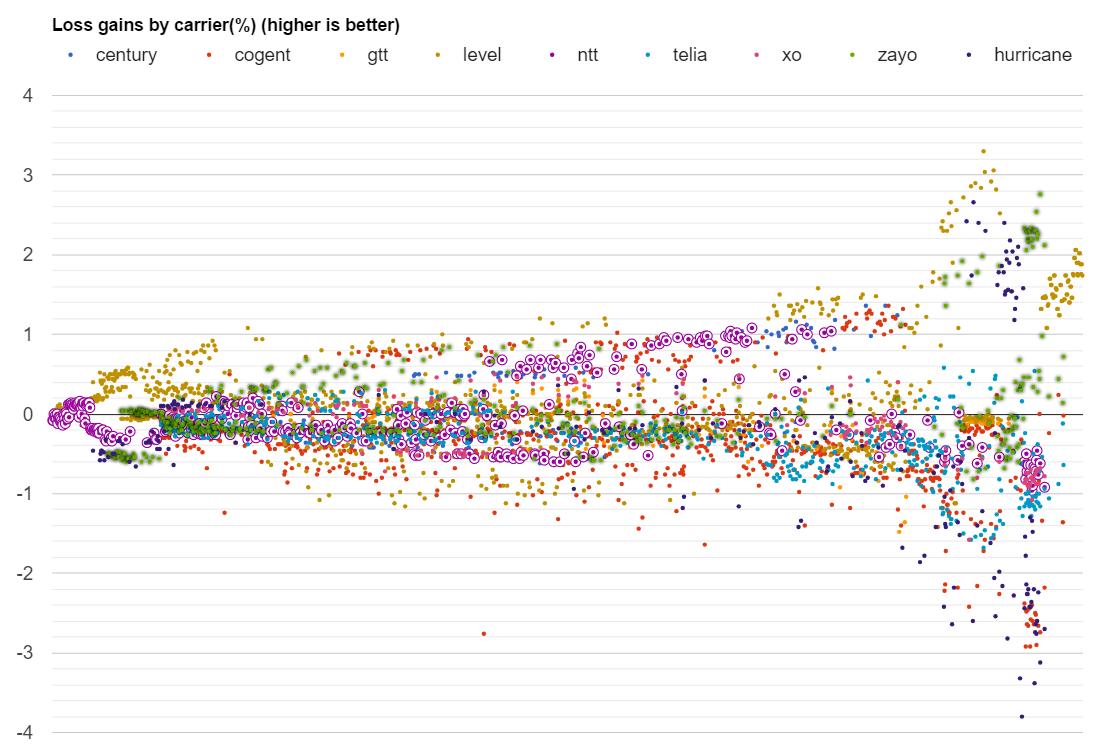
Fig. 6. Better or worse carrier loss (%)
Average placed on the zero line
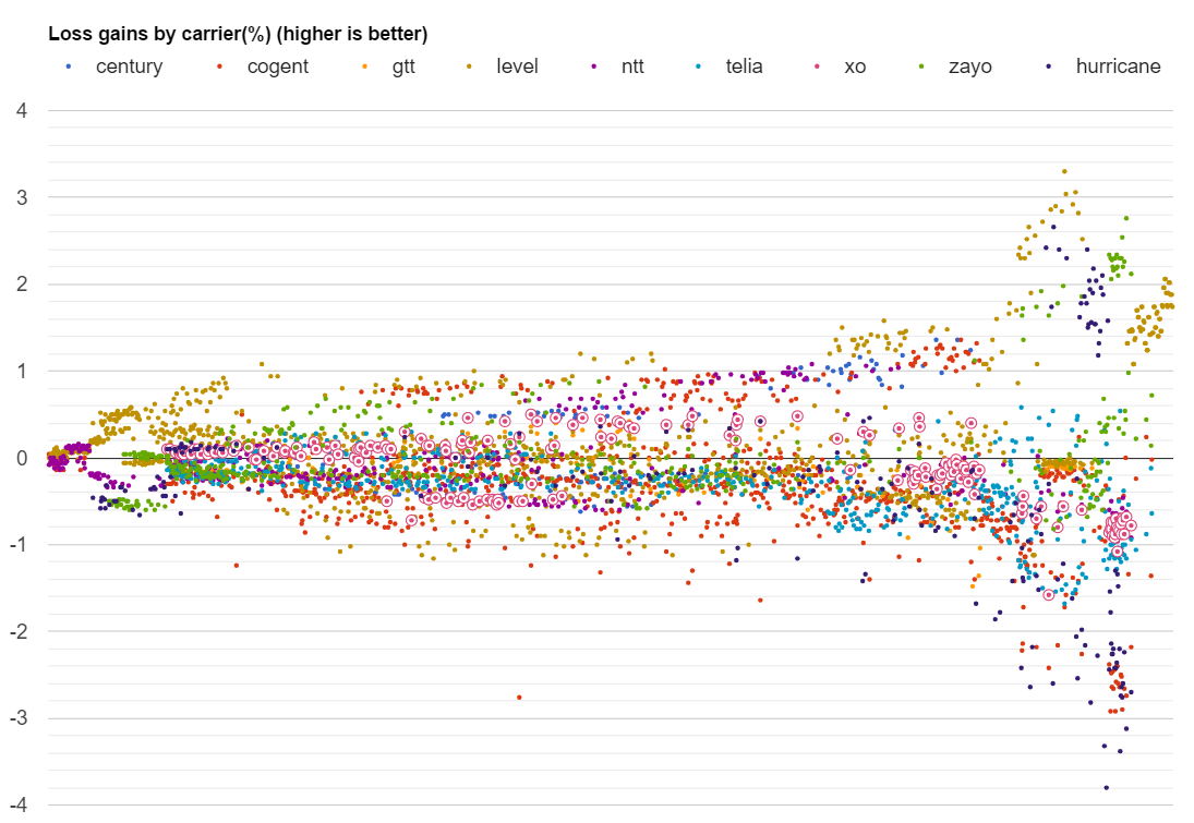
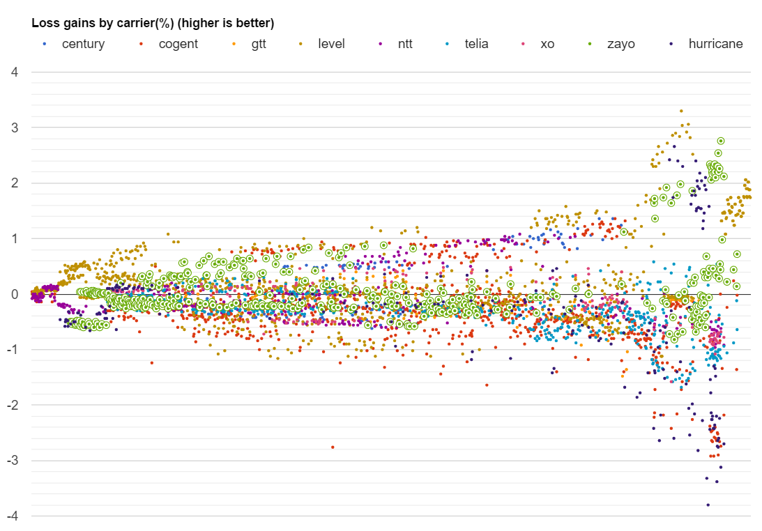
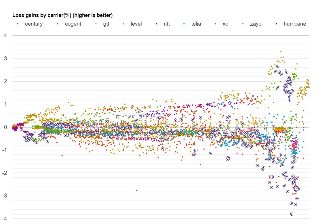
A different representation of the above data places it around the control group (zero line) with gain values by carrier. Values are sorted and charted from left to right by increasing average loss. The chart depicts gains or worsening on a network based on the average control group’s performance – values are shown from left to right following better to worse loss values. The assumption of this analysis is that while a network’s conditions might be better or worse compared to other networks, the conditions tend to be equal across all carriers including the control group. While the carrier’s network is not the culprit causing additional loss, this analysis might be able to suggest whether those carriers peering with remote regions is deficient. Non-systemic issues with carriers will tend to cancel out with values being scattered equally above or below the zero line while systemic issues or gains will have a tendency to place a carrier consistently above or below it. The scatter plot highlights this assumption.
More so, if we average gains or losses compared with the control group we expect the noise to cancel out.
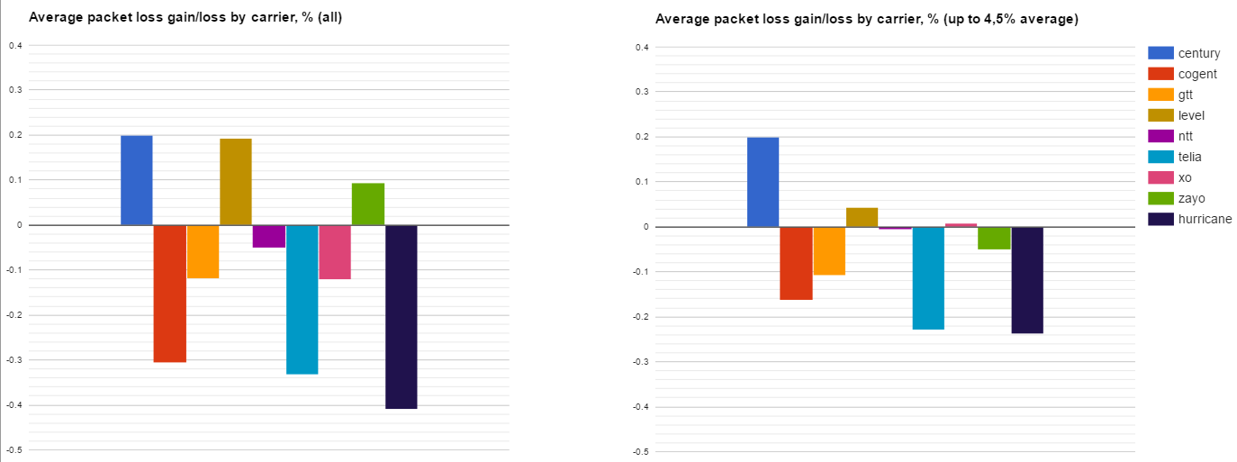
Fig. 7. Average packet loss gains/losses by carrier (April 2017)
Averages determined for ALL datapoints or a cutoff at 4.5% control group applied.
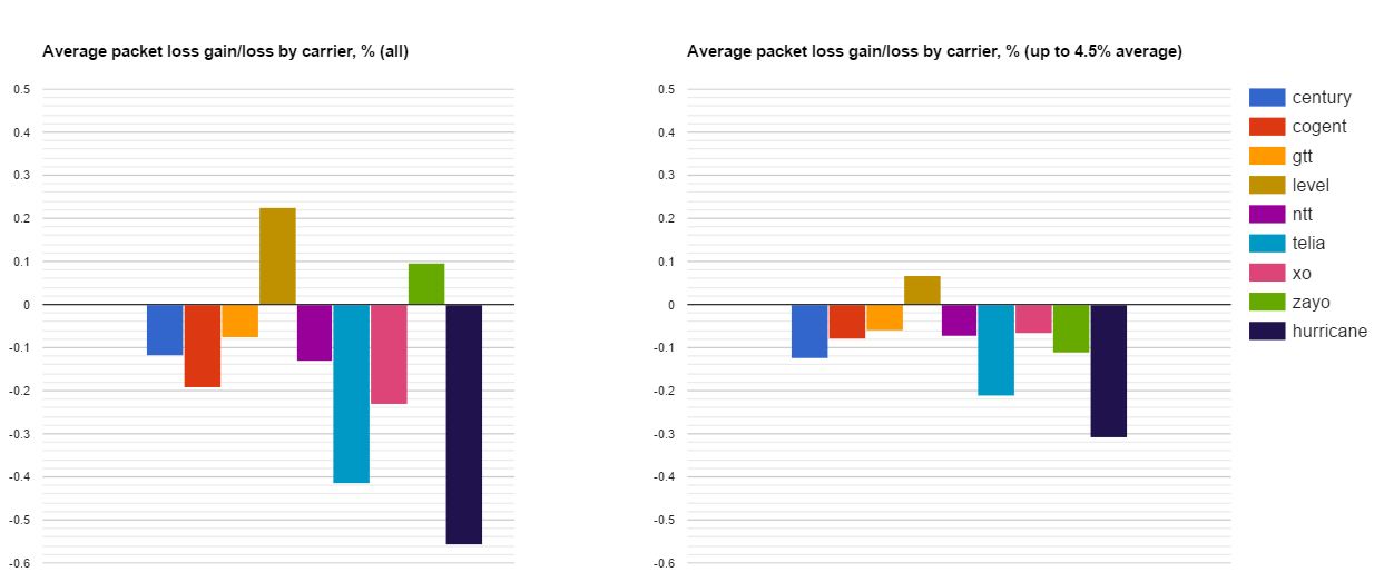
Fig. 8. Average packet loss gains/losses by carrier (March 2017)
Averages determined for ALL datapoints or a cutoff at 4.5% control group applied.
As in March, little differences have been registered between the averages determined for ALL datapoints and the ones that were cut off at the applied 4.5% control group. Zayo, went from gains to losses. Meanwhile, XO showed better results both compared to: April’s cut off at 4.5% control group level as well as the March registered level.
The worst positions show Hurricane, Telia and Cogent. As a result of the applied 4.5% control group to datapoints averages for packet loss, Level 3 position visibly decreased and its leadership became less evident. Much more, after the data set restructuring, Zayo left the group of Tier 1s with better results (Fig. 7).
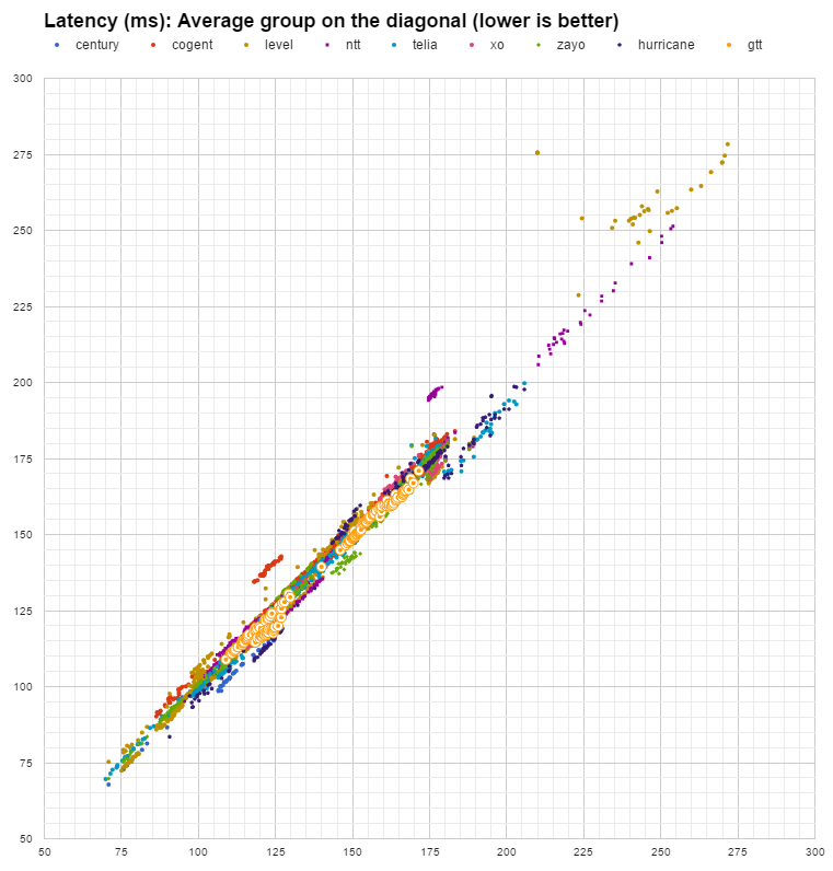
For Latency analysis we use a similar scatter plot to the one we used for Loss. It displays control group values on the diagonal while highlighting individual carrier measurements on the horizontal and on the vertical axis. Datapoints placed significantly and consistently below the average highlight better performing carriers while datapoints above the average highlight worse than average performance.
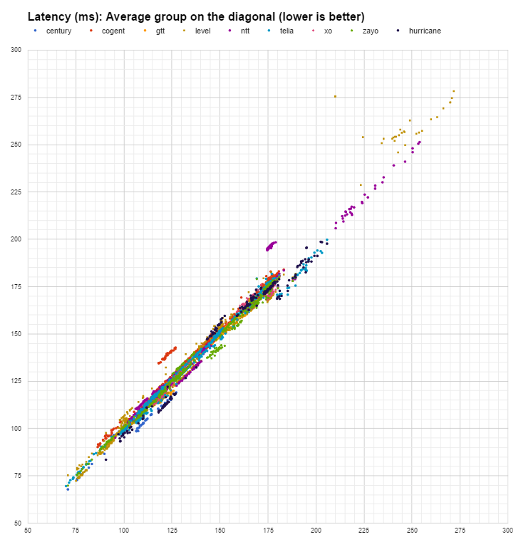
Fig. 9. Carrier latency with average group on the diagonal
Clusters of datapoints below diagonal highlight better performance
Based on data points presented in Fig.9 we can conclude the following:
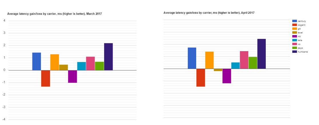
Fig. 10. Average latency gains/losses by carrier Values averaged for the difference between carrier performance and the average group in that network.
The differences in latency above from the control group are averaged with the expectation that better or worse performance will cancel out if the differences are caused by measurement noise.
The results show that during April of 2017 in comparison with March 2017:
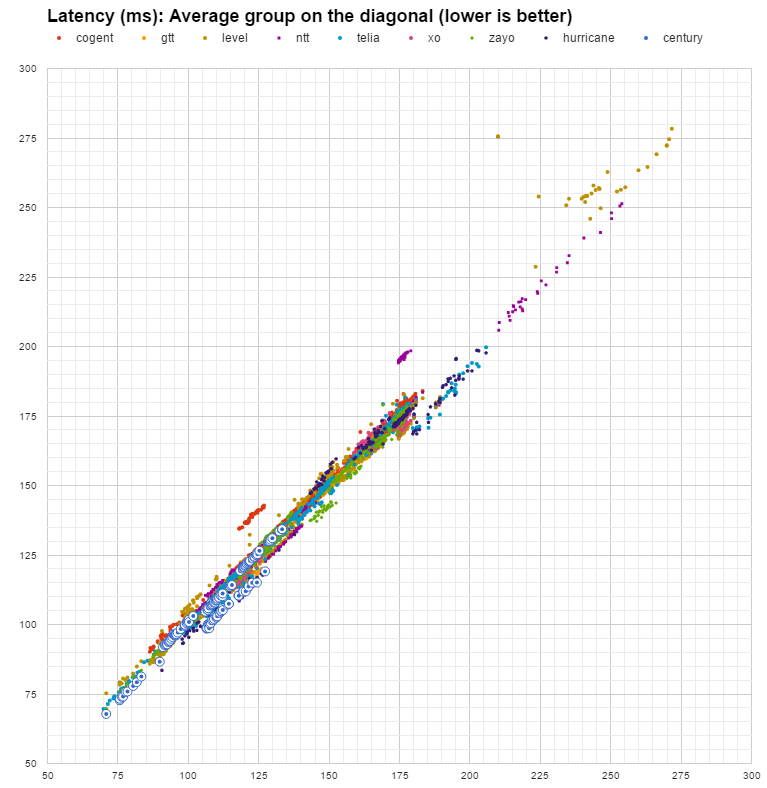
Latency spread chart highlighting Centurylink.
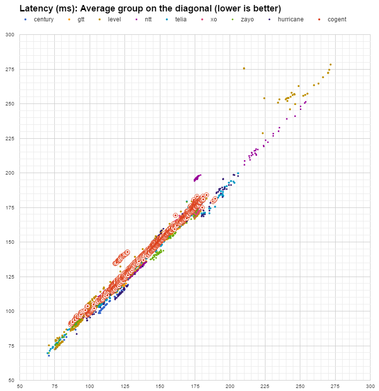
Latency spread chart highlighting Cogent.
Latency spread chart highlighting GTT.
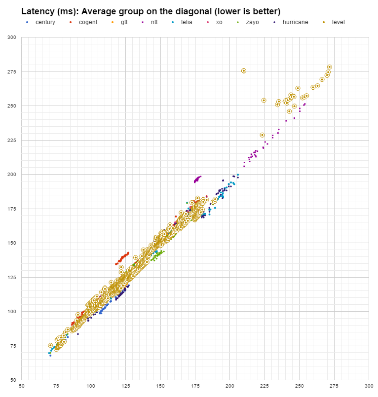
Latency spread chart highlighting Level 3.
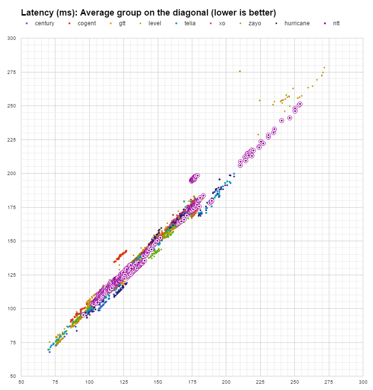
Latency spread chart highlighting NTT.
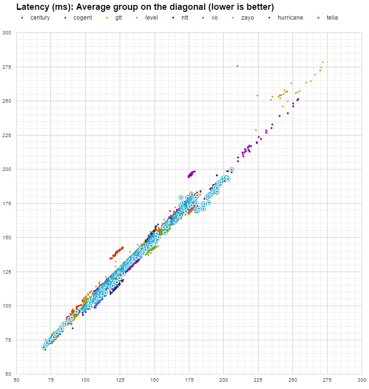
Latency spread chart highlighting Telia.
Latency spread chart highlighting XO.
Latency spread chart highlighting Zayo.
Latency spread chart highlighting Huricane.
Loss improvement/worsening highlighting Centurylink datapoints.
Loss improvement/worsening highlighting Cogent datapoints.
Loss improvement/worsening highlighting GTT datapoints.
Loss improvement/worsening highlighting Level 3 datapoints.
Loss improvement/worsening highlighting NTT datapoints.
Loss improvement/worsening highlighting Telia datapoints.
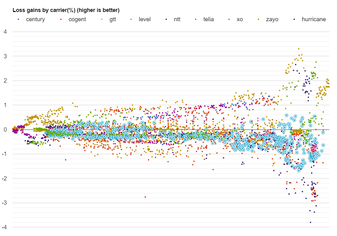
Loss improvement/worsening highlighting XO datapoints.
Loss improvement/worsening highlighting Zayo datapoints.
Loss improvement/worsening highlighting Huricane.
Disclaimer*: The data presented in this report card is intended for information purposes only and is not to be interpreted as any form of promotion or debasement for carriers herein named. Information is obtained from the Intelligent Routing Platform Lite instances, where the compulsory consent of the legal entities for collection of such information is part of the Terms and Conditions document. For privacy protection, the exact location and number of IRP Lite instances are not provided.
Automate BGP Routing optimization with Noction IRP

In networking, communication between devices relies on the efficient exchange of data packets. Among the essential...

The Mail Analogy: Understanding TCP Headers and Reliable Delivery The internet seamlessly transfers data, but how does...

Last week, Africa faced yet again a significant setback in its connectivity infrastructure, with multiple undersea...